Showing posts with label printmaking. Show all posts

Wednesday, December 14, 2011

Leftovers III Exchange @WingtipPress

Time for this year's edition of Leftovers at Wingtip Press in Boise, ID.

LEFTOVERS III 

Prints: 14 (you'll get 12 in return, we keep one for exhibitions and one to raise funds for those who need our leftovers)
Size: Up to 5" x 7" - can be smaller, but NO larger please!
Cost: $12.00
Due Date: March 15, 2012
Ship to: Wingtip Press 6940 Butte Court Boise, ID 83704 USA

Contact Wingtip Press if you want to participate.

Monday, September 19, 2011

Kitchen Lithography - Viral Printmaking

I've seen this now through Printsy, Facebook, Twitter, Printeresting, and a few other sources, so I just had to share.


Lithographie maison — Kitchen Lithographie — Lithography
Uploaded by emilivideo on 8 September 2011

How exciting!  Now, I just have to be able to find time & energy to get back into the studio!  

OK, so that leads to Mommy Update: we're all doing well, thank you.  Kate is now 15 months (yikes!) and not quite walking everywhere but just about, with lots of proto-words and a lot of smiles & giggles.

Saturday, May 7, 2011

International Print Day

Press


Get out your squeegees and spitstickers, resin boxes and liquid tusche, presses and barens, ladies and gentlemen it's International Print Day!! Whatever your printmaking passion, press on, boys and girls, and get some ink on paper today! Share what you've done - make a comment (although be patient; I've had to moderate comments because of all the spam) and send a link to your work from today. Share it with MPC Fine Art Club's printmakers on the Print Day in May blog (they're the group who got the brayer rolling back in 2007), and mark the first Saturday in May in your calendars for next year so that we can be a little more coordinated about it!

Thursday, March 17, 2011

Printmaking Treasuries

Here are a few more:


Enjoy!

Wednesday, February 2, 2011

101 Prints - Malaspina Printmakers

I have donated one of the "Exposed" edition to Malaspina Printmakers' 101 Prints fundraiser:

Exposed

Get your tickets now! $300 guarantees you a fabulous print worth at least $300, and all proceeds go towards Malaspina Printmakers. Find out more information on Malaspina's site.

Monday, January 31, 2011

Leftovers Print Exchange

Lighthouse
Do you have lots of bits and pieces of paper kicking around from various editions? How about old blocks or plates that would combine in an interesting new way? Or do you have leftover prints lying around that you could funk up a bit? Well, then, step right up for the second annual Leftovers Print Exchange! Delivery deadline is March 15, 2011. Join the over 124 (!) participants from around the world and get your special printers' dozen in the mail.

Details
Prints: 14 (twelve for the exchange, one for the exhibition, one for donation to raise funds for a local charity)
Process: That's up to you! (No inkjet though, please)
Size: Up to 5" x 7" - can be smaller, but NO larger please!
Cost: $12.00
Due Date: March 15, 2011

Please advise by return email [amyen at mac dot com] if you wish to participate.

And please invite other printmakers to join us!

Monday, May 3, 2010

And again... Top 50 Bloglist

OK, I don't know what the heck is going on here, but burnishings is on another "top 50" blog list: "50 Incredibly Inspiring Printmaking Blogs". And this list is more a collection of printmakers and printmaking resources rather than print design-related sites. Along with burnishings are a number of other great blogs that I follow:

Debra James Percival's A Printmakers Blog About Art & Printmaking
Marissa Lee Swinghammer's M Lee Fine Art
Ellen Shipley's pressing-issues
Maria Arango's 1000 Woodcuts
Michelle Turbide's Vermont Printmaker
Diane Cutter's The Itinerant Artist
Annie Bissett's Woodblock Dreams
Viza Arlington's VIZArt
Belinda del Pesco's Fine Art Blog
Justin Miller's Bound Staff Press

and, wonderfully, Printsy's Blog, too!

Thursday, April 29, 2010

Burnishings Featured on a "Top 50" Bloglist


Wow! I was just advised that Burnishings has been featured on guidetoartschools.com in their Tips & Tools section of their website under their "50 Must-See Print Design Blogs". My goodness, I'm blushing.

Thanks for the nod!

Printmaking How To - Monotype

This month, Horsley Printmakers' Carol Nunan of Carol's Original Prints has requested that printmakers post a "how to" on their blog about monotypes in May. So I thought I'd take her up on her suggestion (a little early, whatever!). If you're a printmaker and want to do the same, make sure to link back to Carol's blog and send her a comment on her post so that she knows to add your link to her list.

Here's a clip from my website talking about monotypes:

These terms [monotype and monoprint] are often used interchangably; however, I like to think of them as completely different techniques. Both printmaking techniques result in a "one-off" image; you can never repeat that image. Some people have difficulty understanding how this can be a print if only one is produced, but it is the method of production that makes it a print. Probably the best description of the differentiation between these two techniques can be found in Monotype - Mediums and Methods for Painterly Printmaking by Julia Ayres:

"...the term monotype is used for work developed on top of an unaltered plate, utilizing its flat surface, while monoprint refers to monotype work that also includes elements of another printmaking process such as etching, woodcut, lithography, silk screen, and so on."
(Watson-Guptill Publications, New York, 1991, page 8)
I use either watercolour or acrylic paints to produce monotypes. I paint onto frosted Mylar, and while the paint is still wet, I make the transfer by laying a registered sheet of paper over the Mylar and pressing gently by hand on the back of that paper. I repeat the process until I've completed the image. There is another method whereby you prepare the surface of the plate so that you can paint the image in its entirety, leave the paint to dry, then use a moistened sheet of paper to lift the image. I find this method more restrictive, but many artists prefer it because there is an added level of control to how the printed image will turn out.

Embrace, acrylic monotype

OK, so that's a basic outline of how I do it. The above print Embrace was created by painting acrylic onto frosted Mylar and transferring to the registered paper while the acrylic was still wet (i.e. really fast!).

I have my original sketch taped down to a surface, then I tape the Mylar (frosted-side up to paint on) on top of the sketch. I hinge the paper I'd like to print on usually along the longest side. This print was printed on a really heavy hot-pressed watercolour paper (I think Fabriano), and I quite like that surface & weight for doing the acrylic monotypes. I started with the lightest colours first (e.g. light yellow, light green), and work quickly, painting the acrylic on the Mylar then transfer the paint to the paper by flipping the hinged paper down on top of the Mylar and burnishing the back of the paper with my hand. I keep doing that repeatedly until I've got the final image I'd like. This sometimes requires that I let some layers dry a little first, but with acrylics, that doesn't take long at all.

Here are some other images that I've done that way:

Promise of Spring, acrylic monotype

Coming Storm, acrylic monotype

Bamfield Dory, acrylic monotype

As you can see, the results of monotypes can be extremely painterly. I remember my mother, upon being introduced to monotypes, thinking to herself "If I'm going to paint it, why on earth would I go to the trouble of the double work of painting then printing?!?" Then she tried it and discovered the textures that you can achieve only through the transference of paint from the plate to the paper support. You can't get those textures any other way: the surface tension breaking between the plate & paper makes for some wonderful textures that wouldn't occur right off your paint brush.

I do the same process with watercolours; however, I find the acrylics are easier to build bolder, brighter colours with. Here's a monoprint that started with a watercolour monotype to get the colours, then a block print on top for the black part:

Fraser Foreshore Morning, monoprint

This "working wet" technique, of course, is not the only way to make monotypes; it's just the way that I have discovered that I prefer. Here are a (very!) few other printmakers who use monotypes to create their work:

Bruce Waldman
Lori Dean-Dyment
Heather Aston

Thanks Carol, what a great idea. I look forward to seeing what other printmakers send you!

Wednesday, December 16, 2009

Congratulations!


Beverley Peden is the winner! I assigned a number to each entry, and picked Bev's number through Random.Org's random integer generator. Congratulations, Bev, you shall receive your Goose Gallery, hopefully by Christmas.

Out of 34 votes (there were a few people who voted for two!), Bare Branches II was the winner, but only by one vote over Goose Gallery. Kinsol was next, Flow IV had a few votes, and no one faved Sitting (poor Murri!): I guess it is too abstract. Funny, it's actually my favourite!

Interestingly, most people who commented are printmakers, so thanks fellow printmakers for your support and kind words! This was a lot of fun, I shall have to do it again.

Monday, November 30, 2009

Free Art Giveaway!!

Well, 'tis the season, after all, for generosity and thoughtfulness. Thanks to Jeanette's recent giveaway on her blog, which I just won (!), I have been inspired to give something back. I really appreciate all of the people who take time out of their day to read my blog and to visit my website and Etsy shop, and I'd like to demonstrate that appreciation in a concrete manner.

So, until December 15, 2009, please pick one of the following prints as a favourite, post a comment indicating your favourite and a link to your Etsy shop, website, blog, Twitter or Facebook page (or whatever!) so I can get a hold of you if you win, and I'll randomly select a winner from the list to receive their favourite. These are all original block prints, hand-pulled by myself.

'Goose Gallery' - by Amie RomanGoose Gallery

'Flow IV' - by Amie RomanFlow IV

Bare Branches II

'Kinsol' - by Amie RomanKinsol

'Sitting' by Amie RomanSitting

Thanks everyone, and good luck!

Thursday, November 12, 2009

Interview with Printmaker Amie Roman

I was contacted by Larry Hewett, an art instructor at West Columbus High School in North Carolina, asking me for some information about printmaking with MDF, and then asking if I'd consider participating in an interview for his forum. Of course, I'm always happy to talk about printmaking, so here is the interview, which is posted on Art and Art Ed, a Ning social network set up by Larry for artists and art educators to communicate and share with each other.

Larry: Can you tell me something about your arts education in elementary and high school? What about college also?

Amie: My parents kept me entertained from a very early age by providing me with newsprint and crayons. I've kind of been hooked on art ever since. I enjoyed art throughout my schooling, although I wouldn't say I had great art instruction, especially not in high school. I didn't take art for my post-secondary degree; I have a B.Sc. (Hon.) in conservation biology. Most of what I learned was either self-taught, through my grandmother (Caro Woloshyn, an accomplished artist), and I took continuing education courses and workshops through the Federation of Canadian Artists, Emily Carr University of Art & Design, and a local printmaking studio, Dundarave Print Workshop, to expand my knowledge in specific areas, such as elements of design and composition, colour theory, and techniques (painting, printmaking, drawing, etc.)

Larry: Where do you get the inspiration for your prints? From photographs, from life experiences, etc.?

Amie: The inspiration for my work comes from my fascination of the world around us. My scientific background strongly influences my choices of subject matter. Nature and the artifacts of civilization are my subjects. The interaction and inter-relationship of our technological heritage with nature, the irony of the competition between nature and progress, and the sheer beauty and diversity of the natural world form the content of my current work. My imagery is realistic, but my focus is often abstracted through magnification or cropping to an almost unrecognizable result. I work almost entirely from photographs, because then I can get the detail that I wish to achieve, especially with mechanical subject matter.

Larry: Why do you do woodcuts? What about them is so intriguing? Do you do other forms of art as well?

Amie: Please allow me to clarify. I don't actually do woodcuts. None of my prints are the result of blocks carved from wood (the only exception to this was a single wood engraving I carved from boxwood). I do relief printing; most of the material I use as my substrate is man-made (e.g. Safetycut, linoleum and high-density fibreboard or HDF). I don't currently use wood because I don't really want to incorporate wood grain into my work; neither the challenge of carving with and against the grain, nor the texture provided by the wood grain itself. I might change my mind one day!

I enjoy the graphic qualities that I'm able to achieve using relief printmaking. The technique is also very easy for anyone to try: I emphasize the low-tech aspects whenever I'm teaching beginners. Of course, you can get as much equipment and tools that your heart desires; but you can also start with a simple lino cutting set, a wooden spoon, some paper and paint, if you want. Remember potato stamping as a kid? That's relief printmaking!

Other printmaking techniques that I've done include watercolour monotype, acrylic monotype, intaglio (etching), wood engraving and stone lithography. They all offer their individual appeals. Monotypes are extremely painterly, loose, spontaneous and colourful. Etching and wood engraving both provide opportunities for extremely fine line work and detail. Stone lithography is an extraordinary print medium: you can achieve almost any texture, line or mark-making quality with the materials and techniques available in lithography. Unfortunately, it's very material- and equipment-intensive, and the smells of the chemicals rather bother me. I take advantage, now and then, of a friend's litho studio, when I want to create a print that has a more immediate mark-making quality, especially if I want to get the feel of a charcoal drawing in the print.

I have also done watercolour and acrylic painting, and still create pen & watercolour sketches en plein air now and then. I also enjoy pyrography (wood burning), but haven't done much of that lately.

Larry: How many colors do most of your prints have? How many prints in your editions?

Amie: I keep my editions quite small. The largest editions I have are about 40, and that's only when I'm participating in a print exchange, where various printmakers each contribute an edition of prints equal to the number of participants. At the end of the exchange, you have a complete collection of prints from 20-40 other printmakers. Normally, my editions are between 8-12, because I don't have much use for a large edition (I have a hard enough time selling one, let alone 100!). Not only that, each print is very time consuming, and I lose interest after too many pulls of one run. I love figuring out the process of getting all the colours I want, but once I've done a few successful ones, I'm interested in moving onto the next image.

As for colours, I don't have a "standard" number of colours. Three or four colours is pretty common. I think the most colours I've ever done in a print was about eight.

Larry: What size do you normally work with?

Amie: I tend to work on a small scale (3"x4" is common), because I feel that the delicacy of my work mirrors the beautiful minutiae we are surrounded by. The inherent physical restrictions challenge my skills as an artist and as a printmaker. By working on small, detailed images, I encourage the viewer to stop and look more closely, as I do, whenever I see a rusty hinge, an insect, or a tidepool. I have also done some larger prints, especially with lithography and monotypes. Until recently, I didn't have a press, so it's very difficult to work very large without a press. Not impossible, but more challenging than I'm interested in. I also like to enter international miniature print competitions, and they have very specific size restrictions, so that provides another incentive to work small. I have started doing larger prints, however, now that I have a press (see below), and it's nice to have more flexibility in size. Even though the outer dimensions of the prints are getting larger, I still like to work in really tight details, so that hasn't changed, just the surface area covered by the details!

Larry: Do you prefer black and white or color?

Amie: I don't think that I have a preference. I decide whether I'm going to work in colour or not based on the image that I'm working on. Some images speak to me specifically as a black and white; others challenge me to discover the appropriate interpretation of their colours. I do enjoy working with the reduction technique to create a multiple colour image: I start with the first ink colour, print up a bunch of those, then carve away on the block what I wish to stay that colour. I then print up the next colour, carefully registering the block with the first colour on the paper. I then carve away anything on the block that I wish to stay that second colour, and ink up the third colour and print that. And so on, until I've finished all of the colours for the image. As I carve away the block, I can't go back and change something in a previous layer or colour. So I have to print extras at the beginning to allow for registration errors, and to allow for changes to the image as I work through the colours, if I wish. The reduction method, while very challenging, is very satisfying; it's like solving a puzzle. It's also a case of "the whole is greater than the sum of its parts"; if you were to do a multiple block print, colours sit beside each other on the paper, whereas with a reduction, colours layer on top of each other, interacting with each other, much like glazing in a painting, to create different effects and colours than if you tried to mix that colour directly on your palette and print it.

That said, working in a single colour is also very challenging. Providing appropriate textures to imply changes in value and lighting, and getting a perfectly inked single colour both take a lot of work and thought. An effective balance of ink vs paper is very satisfying, especially if the image is graphically strong.

Larry: Do you print with a press of some kind or do it by hand?

Amie: All of my earlier work was printed by hand, and anything that I do during a workshop or demo is still printed by hand. My husband purchased a Richeson baby press for me in the spring of 2008, and we came across an incredible deal on a Conrad Combo etching/litho press that summer. So I've been using a press only for the last year. Before that, and still, when I'm teaching, I used a wooden spoon to burnish the back of the paper, which transfers the image from the inked block to the paper. As I mentioned, I like to emphasize the low-tech aspect of relief printmaking. For the longest time, I used my kitchen table as my studio, carving & printing by hand there.

Larry: Is there one particular print that you feel is your favorite or best? Which one and why?

Amie: That is a really tough question. I guess the short answer is no, not a single one. I have a few favourites for different reasons.


"Pays d'Hiver" (Winter Country) is a beautiful representation of a single colour relief print: the balance of black and white (or rather, ink vs paper, as it's printed onto grey paper), the textures, and the subject matter, all just work really well.


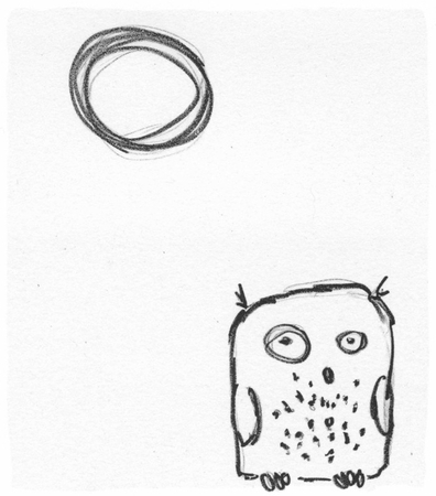
"Ootpik #1 (Not a Night Owl)" is a ludicrous, whimsical piece, and I have no idea where it came from. I don't draw like this! I love it because it's so different.


"Northwestern" - while not my very first reduction cut, it's one of my earliest, and certainly one with a lot of colours (I forget, but at least 6). I feel this is overall a very effective piece, is very representative of my style with reduction, and is of one of my favourite subjects: crows!

Larry: What advice would you give to a student just starting in woodcuts or reduction printing?

Amie: Just try it. Invest a little bit of money in real printmaking ink, and real printmaking paper, because the results will be more effective than using just anything you can get your hands on. Do a little research; if you're trying it on your own, get some books out of the library, and search the internet, especially YouTube. If you're able to take a class, definitely do it - there is so much value you can glean technique-wise that will make your printmaking experience so much more satisfying, stuff that you probably wouldn't have figured out on your own. Ask questions - find a printmaker (online or near by, whatever) whose work you admire and speak with them about it; chances are really good that they'd be only to happy to share their experience, at least a little bit, with you. Join an online printmaking community, like the printmaking forum on WetCanvas!, so you can chat with other printmakers, get some feedback and help. But the bottom line: just try it, and have fun.

Larry: Who are some of your favorite printmakers and why?

Amie: Well, given that I didn't do any art history, and am sorely lacking in any knowledge of printmakers before my time, everyone that I can possibly recommend as my favourites are my contemporaries in time (I would not dare compare myself skill-wise; I've got a long way to go yet!).

Andy English and Jim Westergard are two world-renowned wood engraving artists. Both are remarkably skilled printmakers, both have incredible talent for detail; Andy for an almost Victorian, illustrative quality, and Jim for his quirky sense of humour that shines throughout all his work. Both work almost exclusively in black & white, and I strive to have my work reflect the balance of ink and paper that these two engravers do so skillfully.

Natalia Moroz is a printmaker and illustrator (as many contemporary printmakers seem to be). I love her style - very European, graphic, and effective. Her colour choices are very simiple and naturalistic. I have learned a lot about plotting my colours from Natalia's work.

Sherrie York is a printmaker and illustrator after my own heart: I strive to have her skill at representing the natural world. She spends an awful lot more time drawing than I do; if I ever did as much drawing as she does, then I might approach her skill eventually.

Finally, as a collective, the printmakers on Etsy who are part of Printsy are remarkable artists; I find many of them incredibly inspiring and talented. Check out the Printsy blog for the weekly "Who's Printsy" and "Printsy Interview" features and you'll see what I mean. None of these people were juried into this, yet almost every Printsy member shows very high quality skill and talent in their chosen medium. Maybe it's the nature of the printmaker beast?

Thanks for the opportunity, Larry!

Friday, October 16, 2009

Stamp Making Workshop

Woohoo!!! I'm teaching again!!!

Please join me on Sunday, November 22 at the Upstart Crow in Ladner, for a one day workshop on carving your own stamps*.


Do you love to incorporate stamping into your scrapbooking or mixed media work? Are you looking for a new creative way to make ATC's, greeting cards or gift tags? Join local printmaker Amie Roman (www.amieroman.ca) as she teaches you how to create your own stamps from scratch! Design, carve, and print your own stamps using simple tools and non-toxic,easy clean up materials. Participants will take home their own hand-carved stamps and the knowledge and skills to create more at home. Some supplies required and lots included info at the shop.

*I have tried to hold printmaking workshops repeatedly in different municipalities, and with a variety of art organizations, around the Lower Mainland, and they never got off the ground because of lack of interest. So I figured I'd be sneaky and try to enthuse crafters and artists alike with stamp carving. What the heck - it's the same thing! Printmaking just sounds more complicated and esoteric. Fingers crossed that I'll get a better response from this one.

Monday, September 28, 2009

Upstart Crow


I am delighted to announce that I have a few pieces available for sale at the Upstart Crow, an eclectic and charming art and gift shop in Ladner, BC. If you find yourself in the area, please visit Megan & her crew at the Upstart Crow, open Monday through Saturday from 9:30 am to 5:30 pm and on Sunday from 11:00 am to 4:00 pm.

This opportunity arose from the Delta Arts Council's Gallery in the Garden event this summer, and I'd mentioned it briefly in passing in my blog post about that event, but it really deserves its own announcement, so here you go!!

Saturday, September 26, 2009

Williams Lake Workshop

Williams Lake Workshop Sept 09Well, ladies & gentlemen, as you can see from the delay between last post and this, I've not been particularly active art-wise. The summer months, especially end of August, are taken over with work in the garden, and, as a result, work in the kitchen to put away all those goodies for the rest of the year. You can check out what I've been up to in the garden & kitchen (and a little R&R on the side!) on my other blog, Roman Life.

That said, I just came back from a trip up to my Dad's in Horsefly, and at the beginning of that trip was a fantastic weekend, hosted by the Cariboo Arts Society, where I taught an introductory relief printmaking workshop.

Williams Lake Workshop Sept 09
We started the weekend with a discussion of materials and tools used. For this workshop, I had insisted that everyone use the soft carving materials, like Safety Kut or Speedy Cut, for their blocks, because I find that most people are able to carve those materials fairly easily, especially if they don't have great strength in their hands. I showed them different tools to carve with, and of course discussed safety and sharpening (not that I'm the best instructor for sharpening!).

(C) Sylvia Pare 2009(C) Sylvia Pare

I'd asked everyone to bring some source material, and to choose something to work on that would just be black and white. I demonstrated how I transfer an image from my sketchbook or a photo by tracing onto onion skin tracing paper, then flipping that paper and rubbing the image onto the soft carving block. That automatically reverses your image so that the printed version will come out in the same orientation as your original drawing. This technique works beautifully for the soft vinyl composite blocks, but I haven't had much success with transferring to linoleum that way. As a result of the reversal of the image, we discussed the fact that what you're carving needs to be mirror-image of what you want to end up with on your paper. That always causes a bit of consternation, but if you've got your tracing to work from, and if the tracing paper is thin enough, you can always flip over the tracing paper so that you're looking through the back side of it, giving you the same image that is sitting on your block.

(C) Jo Ann Hamm 2009(C) Jo Ann Hamm

Everyone worked away at carving their blocks for a while, then I demonstrated rolling up the ink on the palette, building up thin layers rather than gobbing it all down in one go. People got really good by the end of the second day recognizing the sound of too much ink, or the feel of not enough ink. We were working with Speedball, and that was a bit of a disaster. It seized up almost immediately. I'd fortunately purchased retarder, which worked quite well, but it still gummed up pretty quickly. At the end of the weekend, I'd asked whether they'd rather have me provide better quality inks for a materials charge, and they'd all agreed that would have been better. The only problem is, of course, as one student pointed out, that they wouldn't have known about the challenges of working with Speedball, and might not have understood the value of having better ink provided for a charge. The other problem is that most people have easier access to Speedball, whereas all other water-soluble inks are mail order only from the States, and that definitely gets a bit pricey, and I certainly wouldn't have wanted to ask people to purchase their own inks first in that case. I didn't want people to use oil-based inks for this workshop, mostly because the smell makes me sick, and I didn't feel like having a huge sinus headache the whole weekend!

Lynda Sawyer & Leslie Lloyd 2009(C) Leslie Lloyd & Lynda Sawyer

While everyone was working on their black & white images, and proofing, and printing, I went on to discuss some simple options for adding colour. You can print on papers that are different colours: everyone tried printing on black paper, using either straight white, or inks that had a bit more white mixed in. Some people had small enough images to try out the Mr. Ellie Pooh Paper samples in shades of lavender, golden orange and natural, that I'd brought. Then we discussed using different coloured inks, and I demonstrated a couple of options. Obviously, just a single colour of ink pre-mixed on your palette, then rolled up onto the block is the simplest, but I also showed how you can use the inks in a more painterly manner, by using multiple brayers and selectively adding colour to the image, like I had done for this print. We also discussed using the back of the block to do a solid colour first, then ink the carved image in another colour, and printing that on top (like this one). Finally, I demonstrated the "rainbow" or blend roll (as I had done in this recent print), and provided everyone with a copy as a sample for their records. Everyone tried their hand at different techniques, and came up with some lovely results.

Williams Lake Workshop Sept 09
At the end of the day, I discussed the reduction cut method to create a multiple-colour print carved from a single block. I explained the process, then asked them to think about an image they'd like to use, and to work out what the light, middle and dark value shapes were in that image. Then I asked that they do a tracing of each set of shapes, separately, so that they could consider how they might have to break down the image for carving the next day. I also suggested that they think about what colours they wanted to use, keeping in mind the values they'd need to achieve with those colours, and maybe write them down on the separate tracings.

(C) Leslie Lloyd 2009(C) Leslie Lloyd

We reconvened the next morning, and everyone had either brought value sketches or tracings of what they wanted to work on. I reviewed the process, and suggested that everyone start with carving away whatever they wanted to remain the colour of the paper. One of the students wished to start with a solid colour, so she inked up the back of her block and printed a series of those first. I made sure that everyone was aware that they should decide how many prints they wanted to end up with in their edition, then add at least another 3 or 4 to that for margin of error.

(C) Lynda Sawyer 2009(C) Lynda Sawyer

Before everyone started inking and proofing, I went over a few different registration methods, including the simplest one of positioning the block on the paper, then flipping everything over to burnish the back of the paper to transfer the print. I also showed them how to do T-bar registration and how to use two right angle corners to align first block then paper repeatedly. Everyone decided that simple was best, and chose the first option for their registration, and it worked very well for almost all of their prints, such that very few were spoiled due to mis-registration.

(C) Sylvia Pare 2009(C) Sylvia Pare

Some students stuck with just three colours: paper as the lightest value, a mid-value, and a dark value, but a couple were very brave and printed three or four colours. One even printed I think five!! Ideally, they should have allowed the inks to dry longer between prints, but the one student who printed the most layers was happy with the textures that were achieved by overprinting still-tacky ink. At the end of the day, everyone managed at least a two-colour reduction, and many went even further. Again, I worked on a demo piece which I sent home with them as a sample for reference to the reduction method.

(C) Kathryn Steen 2009(C) Kathryn Steen

I was absolutely blown away by the enthusiasm of the students, and their intense focus during the whole weekend, as well as their incredible productivity. Everyone went home with many prints, and with a better appreciation of the relief printmaking process. I am very pleased with the results, and am very grateful for the opportunity to have worked with such a talented crew. I hope they invite me back so that we can play with printmaking some more!!

(C) Kris Andrews 2009(C) Kris Andrews

Thank you, Cariboo Arts Society, for the opportunity to share some of my knowledge and experience.

(C) Jo Ann Hamm 2009(C) Jo Ann Hamm

Saturday, July 25, 2009

Catching Up

Wow. It's almost been two months of silence from this quarter. Mostly, that's been two months of no art, which is why nothing's been posted here. A couple of exceptions:

Oceans of Art

We attended the opening of this wonderful exhibition of the Bamfield artists' work in Nanaimo in June. Prior to the opening, a number of the artists & guests met for dinner at le Cafe Français for wonderful, simple French cuisine. We trooped across the street to the beautifully renovated Nanaimo Art Gallery, which used to be a bank, and admired the donations of the participating artists. As far as I know, five pieces sold from the show, the rest were shipped back to Bamfield and are still available for purchase through the Public Education Program.

Here's me at the opening, in front of "Exposed", one of my donations (also donated a couple from the "Flow" series"):


Gallery in the Garden

While not strictly an overwhelming success on the day itself (the weather turned from 30C the day before to about 12C in the powerful, probably almost gale-force winds the day of), I was happy to be invited to participate in the Delta Arts Council's Gallery in the Garden again this year. I sold a piece, and I was also invited to provide some works on consignment to the Upstart Crow, a delightfully eclectic gift shop in the village of Ladner. I might even be teaching some workshops through their facilities this fall; I'll keep you posted!

Katka, one of my printmaking buddies I've met through Wet Canvas! was kind enough to keep me company and brave the less than pleasant weather for a couple of hours. She provided me with a couple of photos of my setup and of me demonstrating printmaking to passers-by. You can read more about the day on her blog, The Blue Chisel.


Yes, I was freezing; unbelievably, I thought to bring a windbreaker, but didn't think about having anything warmer for my legs. I ended up, at the tail of the day, wrapping, sarong like, around my legs, one of the towels that I use to transport framed work. The wind didn't manage to take my tent, but I held on a couple of times just in case. It did take some other artists' tents and certainly blew down many displays, and damaged a few. Thank you, Dave, for your brilliant display stands (which he built for this event last year).

And what else, non-artful (or less artful) tasks, have I been doing in the interim, you might ask?

Well, as always, keeping Printsy (more or less) up to date with the (more or less) weekly "Who's Printsy" feature and the Printsy artist interviews. If you've not yet discovered the Printsy blog, definitely check it out - there are some incredibly talented printmaking artists selling their work through Etsy. If you're one of them, and are not yet a part of Prinsty, please convo me so that I can add your shop to the list.

And it's certainly that time of year again: the food production garden has been in full swing, and is just now starting somewhat to slack off a bit as the cooler weather crops come out and the hot weather crops are not yet ramped up to full production. I haven't posted any new canning recipes yet (although will, at some point, share all of my cherry preserve recipes that I tried this year), but you can always check out what recipes I've concocted or come across, as well as other stuff we're up to here, at my other blog, Roman Life.

Monday, June 8, 2009

Turn Your Photo into Art!

I know, heard it all before, haven't you?

Not like this.

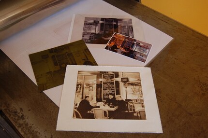
Nancy at Atelier Conti on Etsy, one of our Printsy members, has an offer to turn your photograph into a photogravure etching.


So what?

Well, what about some of those fabulous old family photos you've got stored away in your closet? Or one of your wedding photos? How about a pic you snapped on your recent vacation that just captured the moment perfectly? Turn it into a hand-pulled print, and you don't even have to do the printing!

Contact Atelier Conti for details. I'm going to rummage through my photos to see what I can come up with :)

PS - she's also got a B&B just east of Paris, France in Montmirail; check out Maison Conti. Ah, if only I had airfare...

Wednesday, May 13, 2009

Go with the Flow

I am pretty sure that my Exposed print is of sufficient value to cover the "cost of entry" to the Oceans of Art exhibition at the Nanaimo Art Gallery, opening reception on Thursday June 11, 7-9 pm; however, I also thought that a few smaller pieces may be appreciated, as it can sometimes be difficult to sell large pieces.

I had done a sketch of a piece of kelp (Macrocystis) that I'd photographed on Brady's Beach that I've had sitting in the back of my mind since I did it, with the intention of a reduction cut.

I started off with a yellow ochre layer (didn't photo it), then later did a separate set of prints with a blend (rainbow) roll using yellow ochre, carbazole violet, and phthalo green:

Amie Roman as burnishings on Flickr

Flow II
MDF block print, Dremel carved
Daniel Smith water soluble inks on green kitakata paper
© Amie Roman

and then for some reason, printed the remaining ink on the block (not reinking the block) over the ochre layer and got this:

Amie Roman as burnishings on Flickr
Flow I
MDF block print, Dremel carved
Daniel Smith water soluble inks on green kitakata paper
© Amie Roman

After I finished enough prints for editions for those two, I decided to mess around a little and ended up with these two monoprints:

Amie Roman as burnishings on Flickr
Flow VI
MDF block monoprint, Dremel carved
Daniel Smith water soluble inks on white Rising Stonehenge paper
© Amie Roman

Amie Roman as burnishings on Flickr
Flow VII
MDF block monoprint, Dremel carved
Daniel Smith water soluble inks on white Rising Stonehenge paper
© Amie Roman

Then I got to the part that I'd really intended all along! I carved another layer for the reduction (only one; I wanted to keep it very simple). I printed over some of the Flow I prints (but kept some set aside for their own small edition):

Amie Roman as burnishings on Flickr
Flow III
MDF block reduction print, Dremel carved
Daniel Smith water soluble inks on green kitakata paper
© Amie Roman

And then, of course, had to print over some of Flow II, too (also setting aside some of them with only the first blend roll for their own small edition):

Amie Roman as burnishings on Flickr
Flow IV
MDF block reduction print, Dremel carved
Daniel Smith water soluble inks on green kitakata paper
© Amie Roman

This second, carved layer was also a blend roll, but subtle to see, except for in the edition I did on its own:

Amie Roman as burnishings on Flickr
Flow VII
MDF block print, Dremel carved
Daniel Smith water soluble inks on white Rising Stonehenge paper
© Amie Roman

There are so many things about this series that I'm absolutely tickled by:
  1. The simplicity of the carving is exactly what I had wanted to achieve, and very effectively reflects the gorgeous lines and shapes of the Macrocystis frond that I'd sketched.
  2. The success of the rainbow roll in capturing the oil-slick colours of a slightly decaying, washed up piece of kelp on the beach.
  3. The subtleties in value contrasts between II and III which again, really captures the ever-changing colour shifts of a washed up piece of kelp on the beach.
  4. I got to do a series!! And I played a lot, both with the colour and the printing.
Plus, my baby press is an utter jewel. Love it!

Oh, yeah, and I'd just invested in a set of Foredom ceramic rotary tips for my Dremel tool, and they are absolutely fabulous for carving the MDF in the way I want to.

As you can see, I had a very productive couple of days last week. I won't be donating each of these, but I'll pick a couple to frame up and add to the show.

Now I'm going to be away from the studio for at least another week or so, but hope to get back to it when I return, as I've got lots of ideas that I'd really like to work on.

Monday, February 23, 2009

Large Block Print - Printed!

So after returning from Bamfield, Dave & I had a nasty, awful flu/cold for two whole weeks. The little time I was in the studio, I was definitely not up to carving that large block of MDF started in January. Then I got back to the studio recently, and worked steadily on the carving, to have it complete last night (yay!).

Amie Roman as burnishings on FlickrMurri investigating the carved block this morning

Amie Roman as burnishings on FlickrClose ups of the carving

Amie Roman as burnishings on Flickr
Amie Roman as burnishings on FlickrThis morning, Mom & I reorganized the studio (finally) so that it is laid out more usefully, and with better space.

Amie Roman as burnishings on Flickr
So I took advantage of the better layout and inked up the block tonight. Mom helped me to pull some proofs; I'm having difficulty getting the pressure right on my etching press, mostly because I don't know what I'm doing. So this print was hand-burnished after going through the press, to make sure the transfer of the darks was uniform. This is a blend of carbon black and burnt umber Daniel Smith water-soluble relief ink, on natural kitakata paper.

Amie Roman as burnishings on Flickr(the above is a craptastic photo; it's supposed to be a natural buff paper with a dark brown ink)

We will be mucking around with the pressure again tomorrow morning.

Plus, I got to break in my new Takach brayer. I am in love!

Amie Roman as burnishings on Flickr