Showing posts with label process. Show all posts

Monday, September 19, 2011

Kitchen Lithography - Viral Printmaking

I've seen this now through Printsy, Facebook, Twitter, Printeresting, and a few other sources, so I just had to share.


Lithographie maison — Kitchen Lithographie — Lithography
Uploaded by emilivideo on 8 September 2011

How exciting!  Now, I just have to be able to find time & energy to get back into the studio!  

OK, so that leads to Mommy Update: we're all doing well, thank you.  Kate is now 15 months (yikes!) and not quite walking everywhere but just about, with lots of proto-words and a lot of smiles & giggles.

Thursday, April 29, 2010

Printmaking How To - Monotype

This month, Horsley Printmakers' Carol Nunan of Carol's Original Prints has requested that printmakers post a "how to" on their blog about monotypes in May. So I thought I'd take her up on her suggestion (a little early, whatever!). If you're a printmaker and want to do the same, make sure to link back to Carol's blog and send her a comment on her post so that she knows to add your link to her list.

Here's a clip from my website talking about monotypes:

These terms [monotype and monoprint] are often used interchangably; however, I like to think of them as completely different techniques. Both printmaking techniques result in a "one-off" image; you can never repeat that image. Some people have difficulty understanding how this can be a print if only one is produced, but it is the method of production that makes it a print. Probably the best description of the differentiation between these two techniques can be found in Monotype - Mediums and Methods for Painterly Printmaking by Julia Ayres:

"...the term monotype is used for work developed on top of an unaltered plate, utilizing its flat surface, while monoprint refers to monotype work that also includes elements of another printmaking process such as etching, woodcut, lithography, silk screen, and so on."
(Watson-Guptill Publications, New York, 1991, page 8)
I use either watercolour or acrylic paints to produce monotypes. I paint onto frosted Mylar, and while the paint is still wet, I make the transfer by laying a registered sheet of paper over the Mylar and pressing gently by hand on the back of that paper. I repeat the process until I've completed the image. There is another method whereby you prepare the surface of the plate so that you can paint the image in its entirety, leave the paint to dry, then use a moistened sheet of paper to lift the image. I find this method more restrictive, but many artists prefer it because there is an added level of control to how the printed image will turn out.

Embrace, acrylic monotype

OK, so that's a basic outline of how I do it. The above print Embrace was created by painting acrylic onto frosted Mylar and transferring to the registered paper while the acrylic was still wet (i.e. really fast!).

I have my original sketch taped down to a surface, then I tape the Mylar (frosted-side up to paint on) on top of the sketch. I hinge the paper I'd like to print on usually along the longest side. This print was printed on a really heavy hot-pressed watercolour paper (I think Fabriano), and I quite like that surface & weight for doing the acrylic monotypes. I started with the lightest colours first (e.g. light yellow, light green), and work quickly, painting the acrylic on the Mylar then transfer the paint to the paper by flipping the hinged paper down on top of the Mylar and burnishing the back of the paper with my hand. I keep doing that repeatedly until I've got the final image I'd like. This sometimes requires that I let some layers dry a little first, but with acrylics, that doesn't take long at all.

Here are some other images that I've done that way:

Promise of Spring, acrylic monotype

Coming Storm, acrylic monotype

Bamfield Dory, acrylic monotype

As you can see, the results of monotypes can be extremely painterly. I remember my mother, upon being introduced to monotypes, thinking to herself "If I'm going to paint it, why on earth would I go to the trouble of the double work of painting then printing?!?" Then she tried it and discovered the textures that you can achieve only through the transference of paint from the plate to the paper support. You can't get those textures any other way: the surface tension breaking between the plate & paper makes for some wonderful textures that wouldn't occur right off your paint brush.

I do the same process with watercolours; however, I find the acrylics are easier to build bolder, brighter colours with. Here's a monoprint that started with a watercolour monotype to get the colours, then a block print on top for the black part:

Fraser Foreshore Morning, monoprint

This "working wet" technique, of course, is not the only way to make monotypes; it's just the way that I have discovered that I prefer. Here are a (very!) few other printmakers who use monotypes to create their work:

Bruce Waldman
Lori Dean-Dyment
Heather Aston

Thanks Carol, what a great idea. I look forward to seeing what other printmakers send you!

Tuesday, February 24, 2009

Further Printing - "Exposed" Block Print

Well, after some challenges yesterday, the challenges continued this morning. I received some excellent direction from fellow printmakers with much more experience than I on Wet Canvas. Taking some of those suggestions on, I did manage some better success this afternoon after switching to Faust AquaLine water-soluble inks, still on the kitakata paper. I don't know why. They are more transparent (as discussed with Becky Heimann on Inkteraction), which makes building up darks somewhat more of a challenge. But, the print seemed to go better, and although I did get some "push", it wasn't as bad as with the Daniel Smith inks seemed to get.


Some details:


Anyway, a printmaking friend of mine who's seen my press sent me extremely detailed instructions to set the roller height from scratch, so I shall print those off and give that a go. I've never used an etching press, so I desperately needed these!

Next I'll try a blue black on white paper. The paper will be heavier, so overall the result will be different.

Monday, February 23, 2009

Large Block Print - Printed!

So after returning from Bamfield, Dave & I had a nasty, awful flu/cold for two whole weeks. The little time I was in the studio, I was definitely not up to carving that large block of MDF started in January. Then I got back to the studio recently, and worked steadily on the carving, to have it complete last night (yay!).

Amie Roman as burnishings on FlickrMurri investigating the carved block this morning

Amie Roman as burnishings on FlickrClose ups of the carving

Amie Roman as burnishings on Flickr
Amie Roman as burnishings on FlickrThis morning, Mom & I reorganized the studio (finally) so that it is laid out more usefully, and with better space.

Amie Roman as burnishings on Flickr
So I took advantage of the better layout and inked up the block tonight. Mom helped me to pull some proofs; I'm having difficulty getting the pressure right on my etching press, mostly because I don't know what I'm doing. So this print was hand-burnished after going through the press, to make sure the transfer of the darks was uniform. This is a blend of carbon black and burnt umber Daniel Smith water-soluble relief ink, on natural kitakata paper.

Amie Roman as burnishings on Flickr(the above is a craptastic photo; it's supposed to be a natural buff paper with a dark brown ink)

We will be mucking around with the pressure again tomorrow morning.

Plus, I got to break in my new Takach brayer. I am in love!

Amie Roman as burnishings on Flickr

Friday, February 6, 2009

Tribute to Engraving

Mila Radišić, a copper engraving printmaker from Croatia, composed this lovely article as her Tribute to Engraving.

Being a self-taught engraver and working alone on copper plates I used to think I had developed my own technique. Later, I found out that Jacopo de Barbari (1440?-1516?) worked in the same manner – copper engraving which, by its character, resembles drypoint.

Recently I find out that tradition of metal engraving is dying. This inspires me to write this article. Working alone was not easy. This article, I hope, will be inspiring to others who are struggling out there in order to find their own way of expression, their own way of life.

It takes a few years until I learn how to properly use tools, how to sharpen them, how to prepare copper plate, how to prepare paper...Most important lesson I learned was that character of engraved line depend on character of engraving burins, and engraver's own character. Only perfectly sharpened burins can produce line which characterize engraving, thin on the beginning and at the end. That line is perfect for drawing human face, human body, animals, clothes, different items, telling stories, making atmosphere giving hope...

I use to make engraving directly on the plate with pencil. Then I use to engrave main lines and start to cut my picture. Few years before I «discover» engraving I use to draw pictures with ink using small circles. This is one unfinished «circle» picture!

This way of drawing was very slow but it was some kind of training for demanding engraving. After few hundred of such drawings I start to use engraving. Finding it was some kind of revelation for me. At once I made few engravings. Here is one from that period, also unfinished so that you can see how it is connected to the «circle» drawing above.
As you can see further engraving is in fact a relief in copper. Working it is like carving in stone. While you do it you must have a deep respect and acceptance for noble metal copper.

First engravings I did not print since at that time I know very little about printing process and I just put them on the wall of my studio.

Engraver should be sure in his drawing and should have a sense of humour.


On these engravings you can see how I develop my manner in order to present my vision. It is vision actually which came out of me in this wonderful technique of copper-engraving.


Engraving means thinking straight, overcoming the superficial, external life we so easily fall into. I have a small web site and a great desire to learn more, to share more.

Thank you Mila for the insight into your work and your process. If anyone reading this is knowledgeable about copper engraving, please contact Mila as she is very keen to reach out to the printmaking community and to learn more about her chosen craft.

Tuesday, January 20, 2009

WIP - Large Block Print

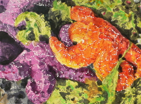
This image has been burning a hole in my brain for about a decade (maybe a wee bit longer).


My step-mom took my friend & me to the west coast of Vancouver Island to spend a lovely day puddling around on the beach and in the tidepools near Port Renfrew. A perfect way to spend time, I always think (but then, being amongst marine biologists all my life has kind of made it difficult to think otherwise).

I had originally started a pen and ink sketch years ago, but abandoned it as not being able to hold my interest. Then I was reminded of the image again when I saw Sherrie York's recent post on her blog for her beautiful reduction linocut "High Tide Detritus":


So I thought to myself, "OF COURSE!" a linocut would be a brilliant way to deal with that image. Well, ok, not linocut, because I'm working in MDF lately, so a block print to be more precise. While I love Sherrie's handling of the colours and her reduction, I wanted to make the image even more abstract, so I've decided that for this one, it'll be all about black & white.

I took a little time procrastinating because I didn't have the photo here (such a pain being between two residences where almost all my art crap is with my studio/press, and I'm not there right now!), so I asked Mom to find, scan & email it to me. That took a little doing on her part; did I mention I am between two residences? That means boxes of crap in both places, neither particularly well organized. Well, standing "O" for Mom, she fished out the photo, digitized it in good pixel resolution, and sent it my way.

The next stage was deciding whether to draw onto a piece of paper then transfer that onto the block, draw onto a piece of paper adhered to the block and carve through, or draw on the block directly. The last won out; the MDF is very smooth and delightfully simple to draw directly onto, and it erases very well. I figured there would be just too much margin for goofing up the image if I tried transferring it in any fashion, so direct drawing it was. I feel that I get a bit closer to my pencil via my carving that way, kind of like the way lithography is more autographic: it's the direct result of the drawing tool, rather than being one step removed. Well, this is still the one step removed with the carving tool making the actual print markings, but at least it's a little closer with the drawn image rather than a transferred image.

So I waited a little bit longer until Dave was able to go pick up the MDF from storage (I have a lifetime supply thanks to an auction-savvy relative who obtained a number of large sheets for a construction project that is no longer going forward).

Then I had to decide on a final dimension. I had picked up a 100 pack of kitakata from Daniel Smith last spring, and I thought that would make a lovely support for this image. So not really "white" so much as a natural buff colour. Anyway, Dave very generously not only retrieved the heavy sheets of MDF, he also chopped them up to dimension on the table saw. This block is 16"x20".

I fiddled with the image on GIMP, cropped it to my liking to make the composition a little more intriguing (I hope), then printed it to a scalable dimension. My final image size is 14"x18", so I overlaid the printout with a grid of 1/2" squares, then I drew out a grid using 1" squares on my block.

The setup was finally finished: now onto drawing!

Well, that in itself took the better part of two weekends and a few days after work (when I wasn't too mentally exhausted to do so). One square at a time. That actually made the process much easier, and caused the image to become even more abstracted in my mind, even though it's a fairly good literal representation of the original (GIMPed) image. Here's a slide show of the development of the image:


Here are snapshots of the development of the image:

originally uploaded by Amie Roman (burnishings on Flickr)
You can see it progressing across the block. In actual fact, I worked on it upside down so that I was going from left-to-right, and so I wouldn't smudge it. OK, and probably to add yet another level of abstraction so that my brain just drew shapes in each little 1" square and didn't panic about the huge project overall.

And the final one that I'm working on now to carve:

originally uploaded by Amie Roman (burnishings on Flickr)You can go to my Flickr account to view larger versions of all of the stages of the drawing.

I have actually started carving, but it's going to take a very long time. There's a ridiculous amount of detail, and I decided that for much of it, it'll take the teeny tiny carving bit on my Dremel. It seems to be working really well so far. Now it has to make the migration over to the studio; I'm thinking of spraying Krylon fixative on the block to keep the graphite from smudging, as I'll be sanding the block prior to inking it anyway. I'll also wrap it up in craft paper and maybe in a garbage bag (for moisture protection), too. And it'll probably get stuck into my large portfolio case, just for good measure. After that many hours of drawing, I would really like to keep it in good shape to work from!

Friday, January 2, 2009

Vantage Point

Dave & I went to Saltspring Island last summer, and wandered around for a day. Dave took me to a private warf on Fulford Harbour, from which you can look at some of the best marine life right off the dock. We had a great time looking there, then went for a bit of a hoof around Ruckle Provincial Park. Dave stood at the edge of one of the bluffs at Ruckle, looking out over the seascape, and I had to take a photo. The photo has been sitting in the back of my mind since then, and I picked up my sketchbook and rendered it in graphite (I'll have to edit this post later and add the sketch; I've not got my computer hooked up to the scanner, and I don't have a digital version of the photo).

I decided that I wanted to do the image in black and white only. This print was done with MDF and the Dremel; carving the fine lines was a bit of a trick. I had to use my v-gouge to define them a little better at the end, but overall, the Dremel worked beautifully. I'm planning on entering this and "Being Shod" in the Federation of Canadian Artists' Human Figure exhibition. As the deadline for submission is the end of January, and I won't be here in my studio until after the deadline, I stayed up late last night getting the first part carved, then finished it off this morning and printed this afternoon. I found that it was really a challenge to print this; it's just one colour (a mix of phthalo blue and Mars black), so building up the ink layer was a little trickier than with a reduction. And I kept smudging things, or the block would slip as I lay it down; all sorts of irritating little things. I finally managed an edition of 10, so that's great. The extras will be given as gifts to various family members, I reckon.


One of the things that I'm really excited about is that I've been doing more drawing and sketching. Up until now, I've been relying a lot directly on photographs; most of my prints are traced from my photos. I don't really like drawing human figures, yet I actually managed to do the sketch and capture the proportions and look really well. I suppose that might not surprise everyone, but it sure surprised me!

Koi - experimenting with inks

I received some sample ink colours (yellow ochre, Cadmium primrose yellow, Cadmium red medium light, and I think one more, but I can't recall what it is now!) from Faust in their AquaLine series of water soluble inks (see here and here for my ink trials where I included Faust inks). I was in conversation with Peter Faust about wanting some other colours, and he again very generously sent me some samples to play with. I believe I received the inks in spring. I didn't get around to trying this until the summer. I was kind intending on blogging about this as soon as it was finished, but when I'd done my "last" layer, I didn't think it was finished, so I put it away until this week. When I pulled it out and had a look at it again, I decided that it was as finished as it was going to get, that I was happy enough with it to edition, and that I might try again but using the MDF in future. Again, this was printed with the black linoleum, which, I now understand, stretched under the pressure of the press (this was the first edition I did on the big press, I believe).

The purpose of this print was twofold: to experiment with my lovely new sample inks, and to try to create a print using very translucent colours. I really wanted the colours of all the layers to come through. Well, I succeeded, and hoped that the final colour would be more opaque, but it wasn't. As a result, the sloppy, er, selective inking that I'd done with the rather opaque cad red showed through more than I wanted.

OK, so here's the WIP:

The first layer is far too pale to see well in the photo, but it was enough to let some of the paper show through. It was a very subtle layer of mostly transparent medium with a touch of pigment, I believe the cad primrose.

The second layer is selectively inked to just add some darker primrose to the body:

The third layer is primrose with a touch of cad red, again just selectively inked on the head:

The fourth layer is now starting to show the volume of the image, the shading of the under-parts, and defining the fins. This is a very translucent layer with a hint each of ultramarine and raw umber:


A slightly darker fifth layer, continuing with the previous idea, with a little more ultramarine in the mix:

The sixth layer is primarily transparent medium, with some cad red:

I thought the red would be covered by the final layer, you can still see some of the rough brayering in the background. I sort of fixed it by brayering a bit more red all around the background, which made it less blue than I'd hoped, but here's the final layer (I think mostly ultramarine and raw umber but also some transparent medium:

As I said, the print worked well enough for an edition, albeit small (only five). I really like the way the translucent layers work. I'd like to try again, but a little more careful application of the brayer next time, or perhaps two blocks (which likely is what I should have done in the first place!). I shall be shipping one of these to Faust to thank them for their samples.

Being Shod - lessons in printmaking

The original photo for this print was taken by my grandfather. Mom has a number of wonderful old photos taken by her dad, as well as her mum's dad, and I'm hoping to translate some of them into prints. This photo was of a horse being shod in a logging camp. The background was pretty over-exposed, so I wasn't really able to get much good detail. So I didn't know what to do when I first started off; you'll see the background in the sketch is pretty vague.


Lesson #1 - decide on a background before you start carving. Because I hadn't decided on a background, I figured the first colour would make up the background by itself:


As a result, I changed my mind about the values in the drawing as I was working on the second layer. Then I decided on the background: I'd make it into the interior of a barn.

Lesson #2 - don't change your mind about values in the middle of carving.

As a result of changing the mind about the values, you'll see that the lightest value falling in front of the back leg of the horse is really high contrast, and not a great value choice. Also, by changing my mind about the background in mid-carving mode, I've got a "halo" around the subject matter, which really is a beginner relief printer's mistake. The background should define the foreground, and vice versa, without having to outline everything.

Lesson #3: Sometimes you can fake it to fix mistakes. I took a little bit of the first colour and dabbed with my fingertip over the light part that bothered me. Then printed the third and final layer on top:


The end result is much improved; you can't tell that I made the fix, and it makes the image read so much better. Once again, I am happy with this print; I seem to be on a roll this week! Good thing, because I'm going to be away from the studio (and press!) for the better part of January. I was trying to cram in as much as I could manage this week.

Once again, this print was carved in MDF with a Dremel, printed using Daniel Smith w/s relief inks on cream Rising Stonehenge paper. I think the dimensions are about 9"x7", and I managed a final edition of 6.

Thursday, January 1, 2009

Pig finished

I spent the last few days finishing off the pig print, and it's finally done today. The more I work with the MDF and the Dremel tool, the happier I am with them.

This print was done with the Daniel Smith water soluble relief inks. I am very happy with their performance, too. I don't think that those inks were slipping during my Xocoatl print, but I am now positive that it was the black linoleum stretching instead. It's printed onto cream Rising Stonehenge paper; the colours of the photos are a little off. So if you look at the paper as being cream, that'll give you an idea of what the print should look like; these photos are a little too cool/blue.

The second colour was a pink made by mixing some permanent red and a little yellow ochre into the pink I'd used in the first layer.

The fourth layer is about 50/50 ink/medium mix, with mostly yellow ochre and a very little amount of burnt umber. I wanted the pink to come through more than if I'd just used yellow ochre straight out of the tube.

The final layer is a dark brown made up of quite a mix: there's a wee bit of phthalo blue, some yellow ochre, burnt umber, and a bit of mars black.


I'm very pleased with this print. I feel that I really captured the pigginess of the sow. I really like the colours that I used, too.

Tuesday, December 30, 2008

Work in Progress - Pig

For the last couple of years, we've been going to the local agricultural fairs in the autumn. It's great watching the kids with their animals, plus I take all sorts of heavy equipment (usually heritage tractors) photos. Mom took a few lovely pictures of a sow and her piglets, and this print is from the "extreme closeup" that she took. I think that the print is about 5" square (give or take). Here's the original sketch:


Unfortunately, the following are craptastic photos. I apologize. I'll scan the final when it's dry enough. Our studio only has natural light (great, but insufficient in winter for photography) and overhead fluorescent lights. Everywhere you stand, you cast a shadow over whatever you're working on. Ugh. But I have a great studio, and a great press, so I can't complain too loudly! Anyway, the first layer is a pale pink, second is a light blue. The print is on cream Rising Stonehenge paper, using Daniel Smith water-soluble relief inks.

First layer

Second layer

I am having a lot of fun with the Dremel, and am extremely impressed with the level of detail I can achieve. It sort of feels like I'm cheating, but what the heck!