
Remember my lovely little Wacom Bamboo graphics tablet? I'm still having fun with it (although less time spent on art lately than I'd like, sigh). Anyway, the little tablet has no protection when I travel back & forth with my computer, so I crocheted myself a Bamboo Pocket. See my post here for the details, but this is the end result:
WARNING: Christmas card spoiler - if you don't want to be surprised in your mail next month, read no further!!
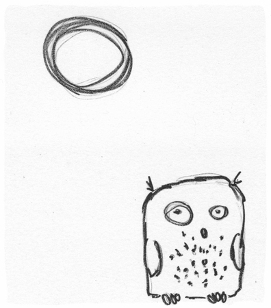
Here's my latest creation - I don't have time this year to carve and hand print Christmas cards, so we're going with digital ones, based on a riff off this original digital sketch: For those of you real digital artists out there, fear not, I realize this is quite amateur, but what the heck, I had fun. I would never call myself a digital artist (check out crackskullbob for an extremely talented selection of mostly digital illustrations); I just goof around with my tablet & GIMP. The real purpose ultimately is to create templates to carve for my relief printmaking, but sometimes it won't get that far. This is one of those times. Sorry for the cop-out this year, folks. Better luck next year.
Sunday, November 22, 2009
Creativity in Craft


Thursday, November 12, 2009
Treasured! "Once Around The Block"
Thanks to kellyjcallahan for featuring me and a heap of other Printsy members on their treasury:
Also featured are:
meganaker
crscheffe
studioAK
YonderPrints
starkeyart
drenculture
GinaD
wingedlion
BirdNerd
RioSalidaArt
hawaiialoha
Interview with Printmaker Amie Roman
I was contacted by Larry Hewett, an art instructor at West Columbus High School in North Carolina, asking me for some information about printmaking with MDF, and then asking if I'd consider participating in an interview for his forum. Of course, I'm always happy to talk about printmaking, so here is the interview, which is posted on Art and Art Ed, a Ning social network set up by Larry for artists and art educators to communicate and share with each other.
Larry: Can you tell me something about your arts education in elementary and high school? What about college also?Thanks for the opportunity, Larry!
Amie: My parents kept me entertained from a very early age by providing me with newsprint and crayons. I've kind of been hooked on art ever since. I enjoyed art throughout my schooling, although I wouldn't say I had great art instruction, especially not in high school. I didn't take art for my post-secondary degree; I have a B.Sc. (Hon.) in conservation biology. Most of what I learned was either self-taught, through my grandmother (Caro Woloshyn, an accomplished artist), and I took continuing education courses and workshops through the Federation of Canadian Artists, Emily Carr University of Art & Design, and a local printmaking studio, Dundarave Print Workshop, to expand my knowledge in specific areas, such as elements of design and composition, colour theory, and techniques (painting, printmaking, drawing, etc.)
Larry: Where do you get the inspiration for your prints? From photographs, from life experiences, etc.?
Amie: The inspiration for my work comes from my fascination of the world around us. My scientific background strongly influences my choices of subject matter. Nature and the artifacts of civilization are my subjects. The interaction and inter-relationship of our technological heritage with nature, the irony of the competition between nature and progress, and the sheer beauty and diversity of the natural world form the content of my current work. My imagery is realistic, but my focus is often abstracted through magnification or cropping to an almost unrecognizable result. I work almost entirely from photographs, because then I can get the detail that I wish to achieve, especially with mechanical subject matter.
Larry: Why do you do woodcuts? What about them is so intriguing? Do you do other forms of art as well?
Amie: Please allow me to clarify. I don't actually do woodcuts. None of my prints are the result of blocks carved from wood (the only exception to this was a single wood engraving I carved from boxwood). I do relief printing; most of the material I use as my substrate is man-made (e.g. Safetycut, linoleum and high-density fibreboard or HDF). I don't currently use wood because I don't really want to incorporate wood grain into my work; neither the challenge of carving with and against the grain, nor the texture provided by the wood grain itself. I might change my mind one day!
I enjoy the graphic qualities that I'm able to achieve using relief printmaking. The technique is also very easy for anyone to try: I emphasize the low-tech aspects whenever I'm teaching beginners. Of course, you can get as much equipment and tools that your heart desires; but you can also start with a simple lino cutting set, a wooden spoon, some paper and paint, if you want. Remember potato stamping as a kid? That's relief printmaking!
Other printmaking techniques that I've done include watercolour monotype, acrylic monotype, intaglio (etching), wood engraving and stone lithography. They all offer their individual appeals. Monotypes are extremely painterly, loose, spontaneous and colourful. Etching and wood engraving both provide opportunities for extremely fine line work and detail. Stone lithography is an extraordinary print medium: you can achieve almost any texture, line or mark-making quality with the materials and techniques available in lithography. Unfortunately, it's very material- and equipment-intensive, and the smells of the chemicals rather bother me. I take advantage, now and then, of a friend's litho studio, when I want to create a print that has a more immediate mark-making quality, especially if I want to get the feel of a charcoal drawing in the print.
I have also done watercolour and acrylic painting, and still create pen & watercolour sketches en plein air now and then. I also enjoy pyrography (wood burning), but haven't done much of that lately.
Larry: How many colors do most of your prints have? How many prints in your editions?
Amie: I keep my editions quite small. The largest editions I have are about 40, and that's only when I'm participating in a print exchange, where various printmakers each contribute an edition of prints equal to the number of participants. At the end of the exchange, you have a complete collection of prints from 20-40 other printmakers. Normally, my editions are between 8-12, because I don't have much use for a large edition (I have a hard enough time selling one, let alone 100!). Not only that, each print is very time consuming, and I lose interest after too many pulls of one run. I love figuring out the process of getting all the colours I want, but once I've done a few successful ones, I'm interested in moving onto the next image.
As for colours, I don't have a "standard" number of colours. Three or four colours is pretty common. I think the most colours I've ever done in a print was about eight.
Larry: What size do you normally work with?
Amie: I tend to work on a small scale (3"x4" is common), because I feel that the delicacy of my work mirrors the beautiful minutiae we are surrounded by. The inherent physical restrictions challenge my skills as an artist and as a printmaker. By working on small, detailed images, I encourage the viewer to stop and look more closely, as I do, whenever I see a rusty hinge, an insect, or a tidepool. I have also done some larger prints, especially with lithography and monotypes. Until recently, I didn't have a press, so it's very difficult to work very large without a press. Not impossible, but more challenging than I'm interested in. I also like to enter international miniature print competitions, and they have very specific size restrictions, so that provides another incentive to work small. I have started doing larger prints, however, now that I have a press (see below), and it's nice to have more flexibility in size. Even though the outer dimensions of the prints are getting larger, I still like to work in really tight details, so that hasn't changed, just the surface area covered by the details!
Larry: Do you prefer black and white or color?
Amie: I don't think that I have a preference. I decide whether I'm going to work in colour or not based on the image that I'm working on. Some images speak to me specifically as a black and white; others challenge me to discover the appropriate interpretation of their colours. I do enjoy working with the reduction technique to create a multiple colour image: I start with the first ink colour, print up a bunch of those, then carve away on the block what I wish to stay that colour. I then print up the next colour, carefully registering the block with the first colour on the paper. I then carve away anything on the block that I wish to stay that second colour, and ink up the third colour and print that. And so on, until I've finished all of the colours for the image. As I carve away the block, I can't go back and change something in a previous layer or colour. So I have to print extras at the beginning to allow for registration errors, and to allow for changes to the image as I work through the colours, if I wish. The reduction method, while very challenging, is very satisfying; it's like solving a puzzle. It's also a case of "the whole is greater than the sum of its parts"; if you were to do a multiple block print, colours sit beside each other on the paper, whereas with a reduction, colours layer on top of each other, interacting with each other, much like glazing in a painting, to create different effects and colours than if you tried to mix that colour directly on your palette and print it.
That said, working in a single colour is also very challenging. Providing appropriate textures to imply changes in value and lighting, and getting a perfectly inked single colour both take a lot of work and thought. An effective balance of ink vs paper is very satisfying, especially if the image is graphically strong.
Larry: Do you print with a press of some kind or do it by hand?
Amie: All of my earlier work was printed by hand, and anything that I do during a workshop or demo is still printed by hand. My husband purchased a Richeson baby press for me in the spring of 2008, and we came across an incredible deal on a Conrad Combo etching/litho press that summer. So I've been using a press only for the last year. Before that, and still, when I'm teaching, I used a wooden spoon to burnish the back of the paper, which transfers the image from the inked block to the paper. As I mentioned, I like to emphasize the low-tech aspect of relief printmaking. For the longest time, I used my kitchen table as my studio, carving & printing by hand there.
Larry: Is there one particular print that you feel is your favorite or best? Which one and why?
Amie: That is a really tough question. I guess the short answer is no, not a single one. I have a few favourites for different reasons.
"Pays d'Hiver" (Winter Country) is a beautiful representation of a single colour relief print: the balance of black and white (or rather, ink vs paper, as it's printed onto grey paper), the textures, and the subject matter, all just work really well.
"Ootpik #1 (Not a Night Owl)" is a ludicrous, whimsical piece, and I have no idea where it came from. I don't draw like this! I love it because it's so different.
"Northwestern" - while not my very first reduction cut, it's one of my earliest, and certainly one with a lot of colours (I forget, but at least 6). I feel this is overall a very effective piece, is very representative of my style with reduction, and is of one of my favourite subjects: crows!
Larry: What advice would you give to a student just starting in woodcuts or reduction printing?
Amie: Just try it. Invest a little bit of money in real printmaking ink, and real printmaking paper, because the results will be more effective than using just anything you can get your hands on. Do a little research; if you're trying it on your own, get some books out of the library, and search the internet, especially YouTube. If you're able to take a class, definitely do it - there is so much value you can glean technique-wise that will make your printmaking experience so much more satisfying, stuff that you probably wouldn't have figured out on your own. Ask questions - find a printmaker (online or near by, whatever) whose work you admire and speak with them about it; chances are really good that they'd be only to happy to share their experience, at least a little bit, with you. Join an online printmaking community, like the printmaking forum on WetCanvas!, so you can chat with other printmakers, get some feedback and help. But the bottom line: just try it, and have fun.
Larry: Who are some of your favorite printmakers and why?
Amie: Well, given that I didn't do any art history, and am sorely lacking in any knowledge of printmakers before my time, everyone that I can possibly recommend as my favourites are my contemporaries in time (I would not dare compare myself skill-wise; I've got a long way to go yet!).
Andy English and Jim Westergard are two world-renowned wood engraving artists. Both are remarkably skilled printmakers, both have incredible talent for detail; Andy for an almost Victorian, illustrative quality, and Jim for his quirky sense of humour that shines throughout all his work. Both work almost exclusively in black & white, and I strive to have my work reflect the balance of ink and paper that these two engravers do so skillfully.
Natalia Moroz is a printmaker and illustrator (as many contemporary printmakers seem to be). I love her style - very European, graphic, and effective. Her colour choices are very simiple and naturalistic. I have learned a lot about plotting my colours from Natalia's work.
Sherrie York is a printmaker and illustrator after my own heart: I strive to have her skill at representing the natural world. She spends an awful lot more time drawing than I do; if I ever did as much drawing as she does, then I might approach her skill eventually.
Finally, as a collective, the printmakers on Etsy who are part of Printsy are remarkable artists; I find many of them incredibly inspiring and talented. Check out the Printsy blog for the weekly "Who's Printsy" and "Printsy Interview" features and you'll see what I mean. None of these people were juried into this, yet almost every Printsy member shows very high quality skill and talent in their chosen medium. Maybe it's the nature of the printmaker beast?


Friday, October 16, 2009
Stamp Making Workshop
Woohoo!!! I'm teaching again!!!
Please join me on Sunday, November 22 at the Upstart Crow in Ladner, for a one day workshop on carving your own stamps*.
Do you love to incorporate stamping into your scrapbooking or mixed media work? Are you looking for a new creative way to make ATC's, greeting cards or gift tags? Join local printmaker Amie Roman (www.amieroman.ca) as she teaches you how to create your own stamps from scratch! Design, carve, and print your own stamps using simple tools and non-toxic,easy clean up materials. Participants will take home their own hand-carved stamps and the knowledge and skills to create more at home. Some supplies required and lots included info at the shop.
*I have tried to hold printmaking workshops repeatedly in different municipalities, and with a variety of art organizations, around the Lower Mainland, and they never got off the ground because of lack of interest. So I figured I'd be sneaky and try to enthuse crafters and artists alike with stamp carving. What the heck - it's the same thing! Printmaking just sounds more complicated and esoteric. Fingers crossed that I'll get a better response from this one.
Monday, September 28, 2009
Upstart Crow

I am delighted to announce that I have a few pieces available for sale at the Upstart Crow, an eclectic and charming art and gift shop in Ladner, BC. If you find yourself in the area, please visit Megan & her crew at the Upstart Crow, open Monday through Saturday from 9:30 am to 5:30 pm and on Sunday from 11:00 am to 4:00 pm.
This opportunity arose from the Delta Arts Council's Gallery in the Garden event this summer, and I'd mentioned it briefly in passing in my blog post about that event, but it really deserves its own announcement, so here you go!!
Saturday, September 26, 2009
Williams Lake Workshop
 Well, ladies & gentlemen, as you can see from the delay between last post and this, I've not been particularly active art-wise. The summer months, especially end of August, are taken over with work in the garden, and, as a result, work in the kitchen to put away all those goodies for the rest of the year. You can check out what I've been up to in the garden & kitchen (and a little R&R on the side!) on my other blog, Roman Life.
That said, I just came back from a trip up to my Dad's in Horsefly, and at the beginning of that trip was a fantastic weekend, hosted by the Cariboo Arts Society, where I taught an introductory relief printmaking workshop.
We started the weekend with a discussion of materials and tools used. For this workshop, I had insisted that everyone use the soft carving materials, like Safety Kut or Speedy Cut, for their blocks, because I find that most people are able to carve those materials fairly easily, especially if they don't have great strength in their hands. I showed them different tools to carve with, and of course discussed safety and sharpening (not that I'm the best instructor for sharpening!).
 (C) Sylvia Pare
I'd asked everyone to bring some source material, and to choose something to work on that would just be black and white. I demonstrated how I transfer an image from my sketchbook or a photo by tracing onto onion skin tracing paper, then flipping that paper and rubbing the image onto the soft carving block. That automatically reverses your image so that the printed version will come out in the same orientation as your original drawing. This technique works beautifully for the soft vinyl composite blocks, but I haven't had much success with transferring to linoleum that way. As a result of the reversal of the image, we discussed the fact that what you're carving needs to be mirror-image of what you want to end up with on your paper. That always causes a bit of consternation, but if you've got your tracing to work from, and if the tracing paper is thin enough, you can always flip over the tracing paper so that you're looking through the back side of it, giving you the same image that is sitting on your block.
 (C) Jo Ann Hamm
Everyone worked away at carving their blocks for a while, then I demonstrated rolling up the ink on the palette, building up thin layers rather than gobbing it all down in one go. People got really good by the end of the second day recognizing the sound of too much ink, or the feel of not enough ink. We were working with Speedball, and that was a bit of a disaster. It seized up almost immediately. I'd fortunately purchased retarder, which worked quite well, but it still gummed up pretty quickly. At the end of the weekend, I'd asked whether they'd rather have me provide better quality inks for a materials charge, and they'd all agreed that would have been better. The only problem is, of course, as one student pointed out, that they wouldn't have known about the challenges of working with Speedball, and might not have understood the value of having better ink provided for a charge. The other problem is that most people have easier access to Speedball, whereas all other water-soluble inks are mail order only from the States, and that definitely gets a bit pricey, and I certainly wouldn't have wanted to ask people to purchase their own inks first in that case. I didn't want people to use oil-based inks for this workshop, mostly because the smell makes me sick, and I didn't feel like having a huge sinus headache the whole weekend!
 (C) Leslie Lloyd & Lynda Sawyer
While everyone was working on their black & white images, and proofing, and printing, I went on to discuss some simple options for adding colour. You can print on papers that are different colours: everyone tried printing on black paper, using either straight white, or inks that had a bit more white mixed in. Some people had small enough images to try out the Mr. Ellie Pooh Paper samples in shades of lavender, golden orange and natural, that I'd brought. Then we discussed using different coloured inks, and I demonstrated a couple of options. Obviously, just a single colour of ink pre-mixed on your palette, then rolled up onto the block is the simplest, but I also showed how you can use the inks in a more painterly manner, by using multiple brayers and selectively adding colour to the image, like I had done for this print. We also discussed using the back of the block to do a solid colour first, then ink the carved image in another colour, and printing that on top (like this one). Finally, I demonstrated the "rainbow" or blend roll (as I had done in this recent print), and provided everyone with a copy as a sample for their records. Everyone tried their hand at different techniques, and came up with some lovely results.

At the end of the day, I discussed the reduction cut method to create a multiple-colour print carved from a single block. I explained the process, then asked them to think about an image they'd like to use, and to work out what the light, middle and dark value shapes were in that image. Then I asked that they do a tracing of each set of shapes, separately, so that they could consider how they might have to break down the image for carving the next day. I also suggested that they think about what colours they wanted to use, keeping in mind the values they'd need to achieve with those colours, and maybe write them down on the separate tracings.
 (C) Leslie Lloyd
We reconvened the next morning, and everyone had either brought value sketches or tracings of what they wanted to work on. I reviewed the process, and suggested that everyone start with carving away whatever they wanted to remain the colour of the paper. One of the students wished to start with a solid colour, so she inked up the back of her block and printed a series of those first. I made sure that everyone was aware that they should decide how many prints they wanted to end up with in their edition, then add at least another 3 or 4 to that for margin of error.
 (C) Lynda Sawyer
Before everyone started inking and proofing, I went over a few different registration methods, including the simplest one of positioning the block on the paper, then flipping everything over to burnish the back of the paper to transfer the print. I also showed them how to do T-bar registration and how to use two right angle corners to align first block then paper repeatedly. Everyone decided that simple was best, and chose the first option for their registration, and it worked very well for almost all of their prints, such that very few were spoiled due to mis-registration.
 (C) Sylvia Pare
Some students stuck with just three colours: paper as the lightest value, a mid-value, and a dark value, but a couple were very brave and printed three or four colours. One even printed I think five!! Ideally, they should have allowed the inks to dry longer between prints, but the one student who printed the most layers was happy with the textures that were achieved by overprinting still-tacky ink. At the end of the day, everyone managed at least a two-colour reduction, and many went even further. Again, I worked on a demo piece which I sent home with them as a sample for reference to the reduction method.
 (C) Kathryn Steen
I was absolutely blown away by the enthusiasm of the students, and their intense focus during the whole weekend, as well as their incredible productivity. Everyone went home with many prints, and with a better appreciation of the relief printmaking process. I am very pleased with the results, and am very grateful for the opportunity to have worked with such a talented crew. I hope they invite me back so that we can play with printmaking some more!!
 (C) Kris Andrews
Thank you, Cariboo Arts Society, for the opportunity to share some of my knowledge and experience.
 (C) Jo Ann Hamm
Tuesday, July 28, 2009
Wet Canvas Exchange - Printmakers Gone Wild
I've known about this exchange for months. For months, I've been busy at work, and hoping that I'll get some time (and energy) free for this. Then I got my dizzy spells back again last month and that put a stop to anything remotely creative. Finally, finally, I was able to sit down and consider some options. I started with one image, and while I liked the idea, the execution was far to abstract to be even remotely recognizable. I don't mind abstract, but I wanted it to be a bit more obvious. Next idea was lovely, started work on that, then realized I just did not have time for a four colour reduction in a minimum of 20 edition. So, now what?
Flipping through my photos, I came across one that I thought might work. And it did, rather nicely, I feel.
 Oyama
OyamaTechnique: relief print
MDF carved with Dremel
Media: Daniel Smith w/s relief ink
(carbazole violet, phthalo blue, burnt umber, carbon black, permanent red)
Dimensions: approximately 9"x6"
Edition: 28
Year: 2009
The problem with a blend or rainbow roll is that it works so much better when your roller/brayer is the same dimension as the print. Mine, even my beautiful new one from Takach, is not. So the colours were applied:
1. Darkest blue with a little brayer
2. Darkest blue to lighter blue with the Takach
3. Lighter blue to pinkish with another smaller brayer
Most of the edition are remarkably good; a few have a couple of solid horizontals that I'm not 100% pleased with. There's also a bit of a porous spot in the MDF which sometimes came through a little bit lighter than I'd prefer, but it actually didn't detract from the image, and added to the blend remarkably well, I thought.
Next time, I'll try sealing the MDF first with something like primer, to see how that goes. That's what people have been telling me, and everyone seems so astonished that I don't seal the MDF first. Generally, it's not been a problem, but once in a while...
Anyway, off to the post office to ship this off!! Hopefully it'll get there in good enough time to not be too horribly late!
Saturday, July 25, 2009
Catching Up
Wow. It's almost been two months of silence from this quarter. Mostly, that's been two months of no art, which is why nothing's been posted here. A couple of exceptions:
Oceans of Art
We attended the opening of this wonderful exhibition of the Bamfield artists' work in Nanaimo in June. Prior to the opening, a number of the artists & guests met for dinner at le Cafe Français for wonderful, simple French cuisine. We trooped across the street to the beautifully renovated Nanaimo Art Gallery, which used to be a bank, and admired the donations of the participating artists. As far as I know, five pieces sold from the show, the rest were shipped back to Bamfield and are still available for purchase through the Public Education Program.
Here's me at the opening, in front of "Exposed", one of my donations (also donated a couple from the "Flow" series"):
Gallery in the Garden
While not strictly an overwhelming success on the day itself (the weather turned from 30C the day before to about 12C in the powerful, probably almost gale-force winds the day of), I was happy to be invited to participate in the Delta Arts Council's Gallery in the Garden again this year. I sold a piece, and I was also invited to provide some works on consignment to the Upstart Crow, a delightfully eclectic gift shop in the village of Ladner. I might even be teaching some workshops through their facilities this fall; I'll keep you posted!
Katka, one of my printmaking buddies I've met through Wet Canvas! was kind enough to keep me company and brave the less than pleasant weather for a couple of hours. She provided me with a couple of photos of my setup and of me demonstrating printmaking to passers-by. You can read more about the day on her blog, The Blue Chisel.
Yes, I was freezing; unbelievably, I thought to bring a windbreaker, but didn't think about having anything warmer for my legs. I ended up, at the tail of the day, wrapping, sarong like, around my legs, one of the towels that I use to transport framed work. The wind didn't manage to take my tent, but I held on a couple of times just in case. It did take some other artists' tents and certainly blew down many displays, and damaged a few. Thank you, Dave, for your brilliant display stands (which he built for this event last year). And what else, non-artful (or less artful) tasks, have I been doing in the interim, you might ask?
Well, as always, keeping Printsy (more or less) up to date with the (more or less) weekly "Who's Printsy" feature and the Printsy artist interviews. If you've not yet discovered the Printsy blog, definitely check it out - there are some incredibly talented printmaking artists selling their work through Etsy. If you're one of them, and are not yet a part of Prinsty, please convo me so that I can add your shop to the list.
And it's certainly that time of year again: the food production garden has been in full swing, and is just now starting somewhat to slack off a bit as the cooler weather crops come out and the hot weather crops are not yet ramped up to full production. I haven't posted any new canning recipes yet (although will, at some point, share all of my cherry preserve recipes that I tried this year), but you can always check out what recipes I've concocted or come across, as well as other stuff we're up to here, at my other blog, Roman Life.


