
I keep finding more wonderful artists and interesting blogs to follow. I'm going to have to watch out, otherwise all I'll have time for is reading my Reader.
Art Stuff
Pikaland introduced me to the creative & incredible wire sculptures of cwroelle on Flickr.
Sarah Wimperis' Muddy Foot Prints shows the construction of her clever and whimsical wool felt sculptures and the challenging art of the person print.
Thanks to michaelnobbs on Twitter, I've been introduced to many, many illustrators, too many to keep track of entirely. However, Elizabeth Perry over at woolgathering has just recently passed her 1,500 illustrations a day mark. I love the layouts of her illustrations in her notebook, her choice of what to illustrate and with what manner of tools. I'm a huge fan of this one, especially.
A community blog featuring art from water, Watermarks' Tina Mammoser struggles with the balance of spontaneity and planning in composition and execution.
I love printmaker/photographer Marja-Leena Rathje's blog, and totally forgot to include her definition of February post in a timely fashion (duh! and happy belated birthday Marja-Leena); I love February's Finnish name "pearl month". Marja-Leena usually has beautiful images of the textures and patterns of nature and the world around us. Join Marja-Leena for a second look...
I like both versions, but I think I prefer option #1 to option #2. Nice exchange print, Amy.
A couple of beautiful, fluid intaglios by Sarah Waite.
Gorgeously carved, richly inked, and beautifully balanced negative and positive linocut by Robyn Sinclair over at Have Dogs, Will Travel.
Edible printmaking via Printeresting. Really.
Science Stuff
Have a look at some rare South African starfish and learn that taxonomists often get it wrong over at The Echinoblog. (I love how he liberally sprinkles enthusiastic exclamation points everywhere!! He teaches natural history as public education outreach... I think it comes with the territory).
The Other 95% has a great video of the "pom pom" crab, so called because of the anemones glued to his pincers (ok, chelipeds to be specific). Aww! "I'm big & scary! I'm big & scary! Watch out for me!!"
And a fish with a see-through head (I'm not kidding - nature is inevitably stranger than fiction), magnetic crocodiles, and beetles with, er, shall we say, battle-ready organs of reproduction. Check 'em out on Zoologix (such a great fix of the nifty and not-so-normal critters in the world).
Thanks to Phytofactor, I've had a quick flip through the "top 100 botanical blogs" (although how they could possibly exclude Watching the World Wake Up and How Plants Work from the list is totally beyond me; obviously they've not been introduced to them), I'm now reading The Fruit Blog. Plus there are some lovely classical botanical illustrations there, how can I resist?
Speaking of WTWWU, find out about buds on deciduous trees and some cool lava-related geology. And, definitely, soap operas make a much better analogy of Darwinian evolution than the Aeneid (why that and not the Odyssey, the original one? Just wondering...).
Thursday, February 26, 2009
What's on Amie's Reader
Tuesday, February 24, 2009
Further Printing - "Exposed" Block Print
Well, after some challenges yesterday, the challenges continued this morning. I received some excellent direction from fellow printmakers with much more experience than I on Wet Canvas. Taking some of those suggestions on, I did manage some better success this afternoon after switching to Faust AquaLine water-soluble inks, still on the kitakata paper. I don't know why. They are more transparent (as discussed with Becky Heimann on Inkteraction), which makes building up darks somewhat more of a challenge. But, the print seemed to go better, and although I did get some "push", it wasn't as bad as with the Daniel Smith inks seemed to get.

Some details:


Anyway, a printmaking friend of mine who's seen my press sent me extremely detailed instructions to set the roller height from scratch, so I shall print those off and give that a go. I've never used an etching press, so I desperately needed these!
Next I'll try a blue black on white paper. The paper will be heavier, so overall the result will be different.
Monday, February 23, 2009
Large Block Print - Printed!
So after returning from Bamfield, Dave & I had a nasty, awful flu/cold for two whole weeks. The little time I was in the studio, I was definitely not up to carving that large block of MDF started in January. Then I got back to the studio recently, and worked steadily on the carving, to have it complete last night (yay!). Murri investigating the carved block this morning
 Close ups of the carving
 This morning, Mom & I reorganized the studio (finally) so that it is laid out more usefully, and with better space.

So I took advantage of the better layout and inked up the block tonight. Mom helped me to pull some proofs; I'm having difficulty getting the pressure right on my etching press, mostly because I don't know what I'm doing. So this print was hand-burnished after going through the press, to make sure the transfer of the darks was uniform. This is a blend of carbon black and burnt umber Daniel Smith water-soluble relief ink, on natural kitakata paper. (the above is a craptastic photo; it's supposed to be a natural buff paper with a dark brown ink)
We will be mucking around with the pressure again tomorrow morning.
Plus, I got to break in my new Takach brayer. I am in love!
Saturday, February 21, 2009
Sketching on a Sunny Winter Day
Last week I grabbed advantage of the beautiful weather, grabbed my sketchbook, and did some stuff. I started with a few (crappy!) watercolour washes, let them dry, then drew on top. The goal was to get the "feel" of what I was looking at, not so much be precise in representing it accurately.
This first one was done beside the little seasonal trickle of water that skirts our wetland; the melt is causing a lot of runoff, so the trickle was burbling along very merrily. Clockwise from upper left (interpreting my chicken-scratch) are the reflections off the moving water with reeds & grasses at the edges, then the movement of water across a rill, submerged pebbles where I just drew the dark areas kind of around the pebbles (not exactly negative space drawing, but it kind of worked out that way), then finally the reflection of a twig as the water moved the reflection. Next is a stand of alders at the edge of our little pond, with conifers in the background. This is pretty much all about interpreting the negative spaces.
 Once again, the weather was beautiful today, but it looks like it's changing, so I wanted to get out and get some more sketches done.
This first one is of the winter aconite (or Acontium) poking up through the leaf litter in a little patch of sunny garden out front. They, together with snowdrops, are probably the earliest little flowers to poke up out of the ground around here, and even then, they're quite late this year because of the heavy snow load we had around Christmas and New Years (there is still snow on our field). Anyway, I did a semi-blind contour drawing with sepia-coloured Pigma pen, then built up the painting. I was trying to keep the glow and delicacy of the flowers, and the loose and messy nature of the leaf litter. Next up was the hazelnut outside our living room window. I parked my stool by the bird feeder and was scolded a few times for interrupting the dinner party, but they continued without a bother nonetheless. I loved the way the flowers of the hazelnut glow in the winter sun, especially against the deep darks of the conifers in the background. Plus, the shadows on the snow were just delicious; I had a lot of fun mixing the colours for them.
 Finally (and I was getting kind of cold by now, so I didn't spend as much time on this one), the old Gravenstein apple tree, all gnarly, pock-marked and in need of a winter hair-cut (Dave's not been over in time yet to do so). Mostly, I had fun dropping wet colours into wet.
  Now, I am definitely not comfortable with watercolours, and am not someone to follow when it comes to using this media, but I sure like to use them in the field for sketching, and adding colour.
Bruce Waldman
Thanks to Elana Goren over at Spider Ink Studio, I have been introduced to another incredible printmaker (they're just everywhere! only academia would dare breathe that printmaking is dead! pbtht!). Bruce Waldman's monotypes (well, he calls them monoprints, but since they don't appear to involve a plate or block that's been etched, carved or altered in anyway, I would maintain they're monotypes) are apparently made with the edges of brayers.
For those non-printmaking folks out there, here's what a brayer looks like, via Wikipedia: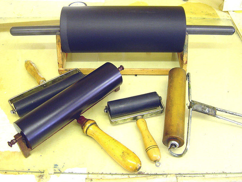
Bruce has very kindly provided me with a description of his process to share with you. It's fascinating:
I work on a large piece of Plexiglas and tape a white piece of paper to the back so that I can clearly see my image while I am working it up. I use only oil based printing inks; mostly etching, but sometimes combined with litho. I use the inks straight out of the container, and do not add oil or any kind of thining substances or solvents to thin the ink. I draw and apply the ink to the Plexiglas directly with small rubber rollers of varying widths, using the flat part of the roller for larger areas, and drawing with the edge of the roller for line work. It is hard to control drawing with the rollers, so it forces me to draw and paint on the Plexiglas in a spontaneous manner, not trying to tightly control my lines and marks while I am making them.
If I don't like parts of the image, I just wipe them away and redraw them. I work both dark on light, and also pull lights out of dark areas with a cloth or paper towel, and then press inked textures and materials on to the image. Sometimes they don't completely work when I print them, so I pin them up on the wall and work directly back into them with printing inks, rollers, pressed textures, and brushes. I only use one plate, and only run it through the press once.This is a very direct and raw way to work. It is really for people who are not that interested in complex techniques, and who love to draw and paint directly and spontaneously. I usually create many bad prints before I get a few that I am really happy with. I love working this way because it allows me to attack the plate with a reckless abandon, which gives the images a feeling of wild motion. I developed these techniques over many years of experimentation as a reaction to creating hundreds of small, intricate, and technically complex ethcings; which I also tremendously enjoy making.


Thanks, Bruce, for the great summary of your process, and for generously letting me show a few of your prints. I have a very tiny selection here, so go check out more of Bruce's prints.
Friday, February 20, 2009
INKTERACTION
Yet another web community for me to waste spend time on! For all you printmakers out there who haven't yet discovered it (although there are already 2414 members, and growing!), check out INKTERACTION the International Printmakers Network.
Set up your own profile page with links to your other sites, load your photos and videos of your work, join in on discussions on their forum, and post printmaking events (both private and public). And there's a blog feature, too, so if you've not yet got one going, it's free! Keep all your goodies in one place, if you like.
And while you're there, pop by & add me as your friend :)
(BTW - I just set up a Facebook Page for me as an artist; yeah, I know, hasn't the interwebby got enough of me yet?!?!)
EDIT - It has been brought to my attention recently that you require an invitation to participate in Inkteraction. If you're a printmaker and would like to be a part of Inkteraction, please contact me via my website and I'll be happy to send you an invitation via Inkteraction. Sorry for the confusion!!
Wednesday, February 18, 2009
What's on Amie's Reader
Quick one this week.
Some printmakers reflect: Vermont Printmaker's Michelle Turbide on what really matters, and Boundstaffpress' Justin Miller on connections and regrets, inspirations for a new work.
There Is Only Make's Marcy shares with us her creative process.
New blogger (but definitely not new online) Brian Holden's My Printmaking Journey follows the development of a linocut study.
More gorgeous sketches by Derek Jones.
Always full of valuable art business information, Making a Mark's Katherine Tyrrell wants us to think about what we're saying about ourselves as artists, not just about our art.
Check out these flamingo-like katydids on Zooillogix, and learn more about global weirding on HowPlantsWork.
Not on the Reader but via Wet Canvas Printmaking Forum - Huff Post on the fair use argument for Shepard Fairey's work.
And via Clint Watson on Twitter, check out the firestorm (it's all over the place!) that Facebook stirred up this week with their changes to the Terms of Service (which they've now rescinded). As one of my FB friends quipped, "maybe they forgot how their network works" - did they not think this would meet with some resistance and stir up a lot of traffic? Maybe they did...
Sunday, February 15, 2009
Figure Show - Federation of Canadian Artists
March 2 - 15, 2009 at the Federation Gallery, 1241 Cartwright Street, Granville Island, Vancouver. My two submitted pieces were accepted:

Media: Daniel Smith w/s relief ink
(yellow ochre, burnt umber, phthalo blue, Mars black) on cream Rising Stonehenge
Dimensions: approximately 9"x7"
Edition: 6
Year: 2009

Media: Daniel Smith w/s relief ink
(mix of Mars black and phthalo blue) on white Rising Stonehenge
Dimensions: approximately 6"x4"
Edition: 10
Year: 2009
Actually Working
Believe it or not, I have actually been working in the studio. I'm carving the block for the large block print for the Oceans of Art exhibition. It's taking a lot of carving though. I also did a little sketching today (shock!) but haven't scanned my sketches. I wanted to try to do the sketches as an interpretation of a feeling, rather than attempting a literal representation. It was kind of fun. I'll post them when I've finally digitized them.
And I've been a busy little social butterfly. I'm now on Twitter and Inkteraction, I created a group on Facebook for Printsy, still keeping Printsy's blog up to date, joined a few more Flickr groups.
And I've been spending much mental effort cogitating some ideas for different uses of printmaking. Nothing concrete yet. I think I need to get the big block carved first before I can get onto the next project. Anything else I want to do just involves carving anyway, and I like to get what I'm carving just done before starting on carving something else.
Oh yeah, and I just bought a Wacom Bamboo tablet and finally got it installed. I'll be playing with that I think tomorrow. Along with my Beginning GIMP book at my side, I'll start putting some of these ideas into illustrated form soon, I hope!
Sunday, February 8, 2009
What's on Amie's Reader
When I first started blogging, and learning about other people's blogs, I had no great way to keep track of what I wanted to read. I started my Squidoo lens on printmaking artists, with the intention of showcasing printmaking bloggers. Well, that sort of went off course a bit, and now there are all sorts of cool printmakers on there. I have kind of run low on steam for keeping that one up to date, because I keep discovering more and more amazing printmaking artists with websites. I will still keep working on it, but I have other projects that seem to be taking precedence lately.
As I was working on the lens, I was trying to add Etsy shops to those artists who are printmakers with Etsy stores. Then Prinsy was forged first as a Flickr group, then as a full-fledged Etsy Team. Our blog got started, and I seemed to be luckily in on the ground floor with that one. I've been blogging two (mostly) regular posts: Printsy member interviews, should be self-explanitory, and "Who's Printsy This Week", a selection of ten items listed by our Printsy members who have used the tag "Printsy" on the item listed. So I've been busy trying to bring people to the Printsy fold, and then trying to get them to give us a little information about themselves on the blog interviews, which have so far showcased some absolutely incredible art by a range of skilled, creative, and talented printmakers. Keep an eye on the Printsy blog for more great stuff.
So back to trying to keep track of those printmaking artists who blog. I like reading people's thoughts on their process and development of their images, on their marketing efforts, on their inspirations, and often on their daily lives. Cue stage right: Google Reader. If you are keen on keeping track of news feeds and blogs, Google Reader lets you do so all in one spot. For those of us with Blogger accounts, it's a no-brainer. For anyone who doesn't yet have a Google account, it's a pretty easy step to set one up. Yes, Google is taking over the world, and I am doing my fair share to see that it happens. Sigh. Well, if they stop having so many great applications to use (I'm also a Google Docs addict), maybe I wouldn't be so enabling .
Another Printsy member recently posted to her blog about her Google Reads, and I thought what a great idea! So I'll try to do a fairly regular feature about what's on my reader, to share some of the wonderful stuff that I already get to read about, but that you might be interested in, too. It's almost entirely art and natural-history dominated, which probably won't surprise anyone here, but I am open to other topics.
So, here's the first installment of What's on Amie's Reader. This is not an exhaustive list by any stretch of the imagination. I might do some kind of theme, or just pick a few that pop out as particularly interesting.
Printmaking
My longest-read printmaking blog would have to be Annie Bissett's Woodblock Dreams. Follow Annie's development of her intricately detailed woodcuts and symbologically deep imagery in her moku hanga work. Her recently completed "Honey, I'm Worried About the Kids" links past with present, tradition with innovation, and the connecting thread of doing what's right for our children with the Pilgrim's migration to the New World.
I think my two favourite printmaking bloggers would have to be Sherrie York on Brush and Baren and Jen Z on Jen and the Greyhounds. Both artists share enthusiasm for their subject matter and frustrations with interruptions to creativity, which really strike a spark of recognition in this reader's heart, and their sense of humour at the world sure helps keep the posts entertaining.
Sherrie's luciously executed linocuts are exquisite to behold, and I'm delighted, always, to follow their progress. She's just started up a new work in progress based on her recent "underfoot" theme.
Jen's blog focuses a lot on her greyhound mates, and her lovely photography of these animals bounding about really captures their spirit. Jen's been taking advantage of her beautiful surroundings lately, taking the dogs off cross-country skiing through upstate New York.
Natural History
One of my favourite aspects of natural history is the "gee whiz" factor: there is just so much out there that escapes our attention almost 100% of the time, that I really appreciate having my attention focused on things that are, truly, remarkable. From behaviour to biochemistry, life and death of the organisms that surround us is source of incredible wonder, and these bloggers share that with us.
Probably the nature-related blog I've longest held on my Reader is A Snail's Eye View, thanks to Sherrie's Brush and Baren link list. Right now, Snail is in the middle of the record-breaking searing Australian weather that is making the bushfires raging across south eastern Australia's state of Victoria so incredibly deadly. I've enjoyed Snail's intimate portrayal of the critters that find their way to Snail's back yard, and the knowledge imparted about these organisms is interesting in a very approachable manner.
Snail then introduced me to The Other 95%. While some of his posts are quite technical, there's just some great stuff that blogger Kevin Zelnio shares with his readers. Check out his recent post on cepahlopod camoflauge behaviour. Kevin also recently hosted the latest Circus of the Spineless, a showcase of bloggers who have posts about invertebrates.
Finally, Watching the World Wake Up is an entertaining combination of mountain biking, hiking and botany through the deserts of the western US. Learn what the three types of photosynthesis are, how photosynthesis is like mountain bikes, and why Mormons are like singlespeeders.
Enjoy the reads, and feel free to share anything of interest that you bump across. You never know, maybe it'll end up on my Reader!
Friday, February 6, 2009
Tribute to Engraving
 Mila Radišić, a copper engraving printmaker from Croatia, composed this lovely article as her Tribute to Engraving.
Being a self-taught engraver and working alone on copper plates I used to think I had developed my own technique. Later, I found out that Jacopo de Barbari (1440?-1516?) worked in the same manner – copper engraving which, by its character, resembles drypoint.Thank you Mila for the insight into your work and your process. If anyone reading this is knowledgeable about copper engraving, please contact Mila as she is very keen to reach out to the printmaking community and to learn more about her chosen craft.
Recently I find out that tradition of metal engraving is dying. This inspires me to write this article. Working alone was not easy. This article, I hope, will be inspiring to others who are struggling out there in order to find their own way of expression, their own way of life.
It takes a few years until I learn how to properly use tools, how to sharpen them, how to prepare copper plate, how to prepare paper...Most important lesson I learned was that character of engraved line depend on character of engraving burins, and engraver's own character. Only perfectly sharpened burins can produce line which characterize engraving, thin on the beginning and at the end. That line is perfect for drawing human face, human body, animals, clothes, different items, telling stories, making atmosphere giving hope...
I use to make engraving directly on the plate with pencil. Then I use to engrave main lines and start to cut my picture. Few years before I «discover» engraving I use to draw pictures with ink using small circles. This is one unfinished «circle» picture!This way of drawing was very slow but it was some kind of training for demanding engraving. After few hundred of such drawings I start to use engraving. Finding it was some kind of revelation for me. At once I made few engravings. Here is one from that period, also unfinished so that you can see how it is connected to the «circle» drawing above.
As you can see further engraving is in fact a relief in copper. Working it is like carving in stone. While you do it you must have a deep respect and acceptance for noble metal copper.
First engravings I did not print since at that time I know very little about printing process and I just put them on the wall of my studio.Engraver should be sure in his drawing and should have a sense of humour.
On these engravings you can see how I develop my manner in order to present my vision. It is vision actually which came out of me in this wonderful technique of copper-engraving.
Engraving means thinking straight, overcoming the superficial, external life we so easily fall into. I have a small web site and a great desire to learn more, to share more.


Wednesday, February 4, 2009
Design
I ran across the Portland State University's Graphic Design program's blog via Pikaland (a blog about illustration and illustrators), and fell in love with this recent post on type experiments by the program's students. While I admire the creativity and flexibility of the students' works showcased, I am very impressed by the clever use of negative space in this one particularly. Who knew I had a typography fascination lurking darkly in the recesses of my mind?
Sunday, February 1, 2009
Katherine Tyrrell - Thanks!!
Once again, versatile artist, informative blogger and prodigious Squidoo lensmaster extraordinaire Katherine Tyrrell has connected to me on her blog Making a Mark.
Katherine's got an extensive list of resources for artists and art-lovers, from techniques in various media to business saavy analysis of working as an artist, Katherine covers just about any corner you might be interested in. Check out her Making a Mark Hub, and her Squidoo Lensmaster list.
Thanks, Katherine!


