
Wednesday, January 30, 2008
New Inks & New Ideas

A couple of weeks ago, Dave & I were on Granville Island (with the intention of picking up my prints from the Malaspina show, which had sold). We wandered into Kroma Acrylics where they've been making acrylics since the 70's. I had been looking into using pigment dispersions with transparent ink base to create colours for printmaking, as I'm underwhelmed by the colours available to market from any of the water-soluble (non-oil-based) inks. After reading a bit about the concept on Wet Canvas, I called Art Guerra in New York to ask him about what he thought about using pigment dispersions in relief printing ink base - his website has an unbelievable list of pigments available. He didn't have any specific experience, but had some very interesting tips (such as concentrations to use) and information, so it was a good long-distance call investment.
Anyway, with that in mind, I spoke with Kevin Head at Kroma about the availability of pigment dispersions through their store. He told me they'd tried that a long time ago, and there really wasn't enough demand to make the effort economically viable (that, and the dispersions do have a shelf life, so the turnover wasn't sufficient). But he suggested that I try combining high quality acrylics, such as Kroma's, which have a very heavy pigment load to carrier ratio, with the transparent base medium, and see what happens. He recommended that at least 50% acrylic/base would be good to try, and possibly higher acrylic content, but he wasn't sure. He reckoned that the water-soluble inks would likely be acrylic based, so that the combination should work.
Well, after looking at Kroma's acrylic chart, I was stoked about the colour opportunities!! And I've used Kroma in my acrylic paintings and monotypes, and I love their paints; so beautiful to work with. I went home and ordered some AquaLine inks from Faust (because I wanted to have SOMETHING to print with in case the experiment failed), as well as a tub of AquaLine transparent base, and I also ordered the Graphic Chemical water-soluble relief ink extender (which is really a transparent base) for the acrylic experiment. In my communications with Faust & GC, I discovered that the GC water-soluble inks were, while not "acrylic", certainly similar, so I figured the GC ink base would be the best candidate.
My Faust inks arrived first, so I doodled some ideas and carved a few small blocks to play with. Today was the ink testing day! I did a few straight-forward black ink on white Masa paper, but then I had some fun.

This one is a simple two-colour, two block print. The yellow background is the Faust diarylide yellow at full strength.

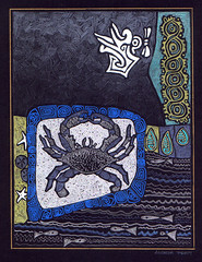
This one was a bit more fun - I picked up strip of ink from the inking block with a piece of mat board and pulled the "bead" of ink down the paper (thanks Pat! This is how he tests his litho colours before proceeding with colour proofing). The mix is probably 75% base to ink. Then I printed the crow on top of that with full strength black.
Then I tried the Faust base with the acrylic. Well, I don't think the Faust base has any acrylic properties; the combination was an instant gumbo effect. Kind of cool, actually, but totally useless. I couldn't brayer it out at all, it just went sticky and tacky all over. I was somewhat disappointed, but wasn't defeated yet, so I continued to play with the existing inks for a while longer this afternoon, doing a few editions.
Finally, I picked up the GC base from the post office this evening, and tried some acrylics with it.

The first colour is Kroma's Burnt Sienna. The next colour is actually Golden's Heavy Body Acrylic in Cerulean Blue, although you'd never guess it from the photo. As you can see, the layering potential is spectacular. The ink mixture stayed open for at least two hours before I cleaned it up. And when I say open, I mean it remained workable, even the stuff that was brayered out on the slab, and it didn't gum up on the brayer at all. Yet the little bit of acrylic that I'd accidentally left on the slab beside the mixture was dried rock solid. So Kevin's theory worked on this base, which, I'm assuming, is sufficiently acrylic-like to not have weird interactions with the acrylic. I suppose if I used even more acrylic, the mixture would get less and less transparent (well, depending on the pigment), but I'm not sure how the workability would hold up. I'll definitely experiment more with this, but for now, I'm quite delighted with the possibilities.
Thursday, January 24, 2008
Made by Hand
I finally took the plunge and have set up my Etsy online storefront, one of my goals for 2008. I dithered for a while because of being unsure of shipping options etc., but then I just thought, what the heck. I'll set it up and see what comes.
What is Etsy?
Etsy is an online marketplace for buying & selling all things handmade.
Our mission is to enable people to make a living making things, and to reconnect makers with buyers.
Our vision is to build a new economy and present a better choice:
Buy, Sell, and Live Handmade.
So, go buy something handmade! :)
Wednesday, January 23, 2008
Intro to Relief

I had a very pleasant session with a lady from the Port Moody Art Association as a result of my demo in November. She had signed up for a relief course through Emily Carr to start this month, but apparently there weren't enough people who had registered so the class was canceled. She was wondering if I'd mind giving her a one-on-one class; would I?! That's my favourite kind! Well, actually, I just like teaching generally, but I definitely enjoy one-on-one. So we had a three hour introduction to relief printmaking. She managed to carve a good portion of her block, enough to be able to proof it and get an idea of what it looked like. I think she enjoyed herself. She also does beautiful, fluid, life sketches from models; apparently there's a group she belongs to in Coquitlam that meet weekly for life drawing. Anyway, I gave her a piece of high-density blue foam insulation to take to her next life drawing session to draw directly into that with a hard pen/pencil/dowel, then print that, and she was most intrigued. I hope that she comes back for some further help; I really enjoyed it, and I've got lots left to explain!!
Sunday, January 20, 2008
Collaborative Beginnings
Andrea Pratt, AFCA, is an accomplished acrylic painter whom I met through the Federation of Canadian Artists, but also through this blog. She commented on one of my posts, and as a result of her comment, I thought I'd get in touch with her to see if we could do a skills trade, a collaboration of techniques and knowledge, so that we could each learn something new. I greatly admire her work; she has a very distinctive style, and I love her use of symbology and theme to develop her imagery. We met on Friday to have a brain-storming session to see where we could take our interests in each others' work. I'm very excited because I feel that I can utilize some elements of her methodology and incorporate them into my printmaking. I agreed to be a test subject for her regarding the development of a teaching module so I'll be working on an acrylic painting based on her techniques, but I'm definitely going to be working on prints, too!! Its quite ironic - Andrea indicated recently in her blog that she's stuck inspirationally; I have been too, but I think this collaborative effort will help to unglue my inertia.
Wednesday, January 16, 2008
Winter Print Exchange
One of the great things about participating on online communities is sharing stuff. The WetCanvas! art community has a great number of opportunities to do so, one of which is through their project system. I set up a winter print exchange in which twenty other printmakers on WetCanvas! signed up and sent their prints around the world to each other. We all had the delight and anticipation of mail arriving on our doorstep with incredible, tiny, works of art; each unique, each delightful in their own right, but together as a group, quite an impressive collection.
I present, with great pleasure, the 2007 winter print exchange!


Thank you all for participating and supporting this exchange. It was fantastic!
Monday, January 7, 2008
Pressing Matters in Printmaking
 I was asked to participate in the invitational "Pressing Matters in Printmaking" exhibition at the Southern Highland Craft Guild in Asheville, North Carolina, from January 19 - May 18, 2008. I'm quite excited because it's the first curated event that I've been asked to participate in. There are fifty artists, and each was invited to submit up to two pieces. I submitted:

"Crossroads", 2007
Reduction cut relief print
Speedball water-soluble inks on black Rising Stonehenge
Dimensions: 7"x4"

"Turtle Pair", 2007
Stone lithograph, printed at Pal Press, Mill Bay, BC
Graphic Chemical lithography inks on Rives BFK
Dimensions: 5.75"x11.5"
Nikki Josheff, the curator, contacted me via email. She had seen my work after coming across my website through an internet search for printmaking. She really liked my stuff, especially the lithos (thanks Pat!). As that was what she was particularly interested in, I definitely wanted to send one of my lithos, and "Turtle Pair" is just a nice image, all around, so that was my choice. But litho is not what I normally do, so I really wanted to include one of my reduction relief prints, too. As "Crossroads" had been recently accepted into a fairly prestigious exhibit at the Federation of Canadian Artists, I thought it would be a good one to send.
I was quite amazed to be discovered, and thoroughly honoured to be invited, so I'm particularly chuffed to be able to participate. Fortunately, both pieces arrived safe & sound without any damage to the frames (courtesy of a skookum crate built by Dave to protect his lovely frames).
Sold!
I went down to Malaspina Printmakers today to pick up my two pieces from their annual Christmas members' exhibit to find that both pieces had sold!! Yay!! Of course, it would have been nice if someone had let me know before I drove all the way in, but that's OK! It's a nice surprise.
Sunday, January 6, 2008
Compositional Dilemma
I have a compositional dilemma. I had an image that I really wanted to incorporate into a print: Apparently it's a swallowtail larva. Anyhoo, loved to colours, loved the shapes, and wanted to do something with it. Here's the kiss of death - "something" is not very well defined, and when trying to do a piece, it's usually a good idea to have an overall sense of what you want to do with the composition. Many artists would actually argue that it's essential to have your composition plotted out well before you start the final work. I'm lazy and rarely do that. I just wanted to turn this charming little guy into a reduction print.
I had some interesting light-weight paper that I purchased years ago from Paper-Ya on Granville Island. I believe the printed background are Japanese prayers. Anyway, I thought I might use it as my support for the print. So here's the first result (the overall image is about 7"x5"): Funny, the scanned image actually looks better than the real life one for some reason! Anyway, from a composition perspective, I think it's pretty weak. I suspect it's because the print is sitting on top of the paper, rather than being part of an overall composition. I thought perhaps adding another element would help. I had a butterfly block (actually, appropriately of an Anise Swallowtail!) from my BC Bestiary that I thought I'd use:
 But it seems too big to me, and really doesn't help the composition. So I thought I'd try a smaller one (recut, but the same butterfly I used for Chloe's stamp):
 Again, not really adding to the composition. Maybe if I did another reduction cut? I don't know, I'm stumped. Any suggestions? Dave reckons one of the problems is that the larva is not really climbing on anything; but I'd kind of hoped it looked like it was climbing up the text. Hmmm, maybe not.
Subscribe to:
Posts (Atom)


